| Author | Thread |
Comments Made During the Challenge  |
|
|
08/30/2007 06:12:07 PM |
|
 Photographer found comment helpful. Photographer found comment helpful. |
|
|
08/30/2007 02:32:08 AM |
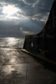
| Seems it's overexposed. And it would probably look better if it was totally symmetrical, and with less distracting elements. |
|
| Photographer found comment helpful. |
|
|
08/29/2007 10:24:15 PM |
|
| Photographer found comment helpful. |
|
|
08/29/2007 08:41:42 PM |
|
| Photographer found comment helpful. |
|
|
08/29/2007 07:23:28 PM |
| seems a bit over exposed in areas |
|
| Photographer found comment helpful. |
|
|
08/29/2007 05:18:07 PM |
|
| Photographer found comment helpful. |
|
|
08/29/2007 02:21:48 PM |
| I like the composition, but I think it's over-exposed. |
|
| Photographer found comment helpful. |
|
|
08/29/2007 01:26:21 PM |
| It is a little bright for me. |
|
| Photographer found comment helpful. |
|
|
08/29/2007 01:16:40 PM |
| Light area is blown out. Needs more consistency. |
|
| Photographer found comment helpful. |
|
|
08/29/2007 03:22:55 AM |
|
| Photographer found comment helpful. |
|
|
08/29/2007 01:21:15 AM |
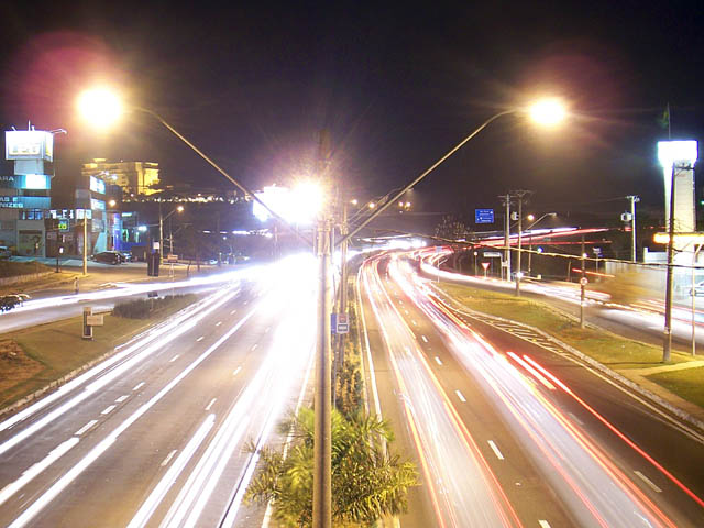
| those street lights ruin this |
|
| Photographer found comment helpful. |
Home -
Challenges -
Community -
League -
Photos -
Cameras -
Lenses -
Learn -
Help -
Terms of Use -
Privacy -
Top ^
DPChallenge, and website content and design, Copyright © 2001-2025 Challenging Technologies, LLC.
All digital photo copyrights belong to the photographers and may not be used without permission.
Current Server Time: 03/11/2025 02:16:55 PM EDT.