| Author | Thread |
|
|
10/18/2007 08:38:25 AM |
Uhm.. The border is not supposed to be �a border�, it supposed to be an opening on your monitor, and it has curved edges, like a hole looking inside to the cat. It's not supposed to be something like a frame border. Subject is "Jump out from your monitor" from that opening.
I missed the target waaaaay of on this one, no one understood the "borders" here :P
That�s ok though, next time I use something else to make you think it's a window to beyond LOL
Cheers |
|
|
|
09/09/2007 04:30:46 AM |
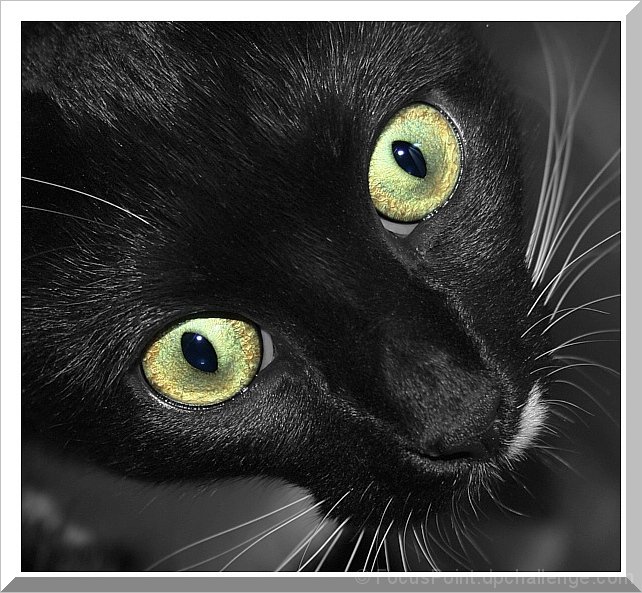
I'm an emotional voter first, technicals second. I do not like cats. So... for me to set aside my vehement dislike for these creatures, the shot has to be something pretty darn special. This image is not helping me overcome my bias. Here is my thought process while voting, hope it gives you some insight:
The first thing I notice (after the initial shock of those evil, evil eyes ;P) is the harsh lighting. The catchlights have purple fringing and it looks like bad flash fill. But hey, it's a black cat, how else are you supposed to get detail in the fur, right?
Ok, so then I force myself to take a closer look and realise there isn't a heck of a lot of detail in the fur on the nose or between the eyes anyway. Is this a focus issue, or something that went astray in pp? Either way, the vote isn't looking all that hot for you at this point.
I didn't much like the downward point of view, nor the diagonal tilt in composition. Not sure I could feel intimidated by something I'm looking down on, much less think it would jump out at me.
Then, I notice the border... :( I'm a huge fan of borders and matting to 'close' images, but I think it needs to be kept fairly simple. I realise you were going for a screen/3D look, but since I had issues with the image itself, that effect didn't work for me.
In a nutshell, I really did take a good hard look at the image and not just the cursory 3 seconds most give, and... well... I still didn't find it very appealing in any way.
Feel free to PM me if you're not sure of anything I've said here. I've tried to be as honest as I can :)
Cheers,
Rina. |
|
 Photographer found comment helpful. Photographer found comment helpful. |
|
|
09/08/2007 02:05:12 PM |
| Those eyes would make a great metallic brush :D |
|
| Photographer found comment helpful. |
Comments Made During the Challenge  |
|
|
09/05/2007 07:27:02 PM |
|
| Photographer found comment helpful. |
|
|
09/05/2007 10:33:46 AM |
| Not really, it doesn´t have that 3-D look, if that is the idea you would have needed to show more of the surroundings and maybe a paw coming over the frame you made. |
|
| Photographer found comment helpful. |
|
|
09/05/2007 08:46:11 AM |
| Very good lighting on the dark hair. |
|
| Photographer found comment helpful. |
|
|
09/05/2007 04:39:29 AM |
| Nice sharpness and Good use of space. |
|
| Photographer found comment helpful. |
|
|
09/04/2007 11:52:25 PM |
| Beautiful image! Exceptional clarity and detail. Somehow the frame is off tho. Maybe because the upper left doesn't have a line or something to make it look 3-D and match the other corners? (7) |
|
| Photographer found comment helpful. |
|
|
09/02/2007 04:58:22 AM |
| wonderful cat-portrait. really good sharpness. The border looks elegant. Well done |
|
| Photographer found comment helpful. |
|
|
09/02/2007 03:28:27 AM |
|
| Photographer found comment helpful. |
|
|
09/02/2007 02:20:10 AM |
| Nice shot - Like the tones - Interesting composition and of course killer sharpness. |
|
| Photographer found comment helpful. |
Home -
Challenges -
Community -
League -
Photos -
Cameras -
Lenses -
Learn -
Help -
Terms of Use -
Privacy -
Top ^
DPChallenge, and website content and design, Copyright © 2001-2025 Challenging Technologies, LLC.
All digital photo copyrights belong to the photographers and may not be used without permission.
Current Server Time: 03/11/2025 01:35:22 PM EDT.