| Author | Thread |
|
|
02/18/2004 02:30:08 PM |
| i like this picture a lot, sorry i didn't vote in this challenge... one of the most creative interpretations... |
|
 Photographer found comment helpful. Photographer found comment helpful. |
Comments Made During the Challenge  |
|
|
02/10/2004 10:10:49 PM |
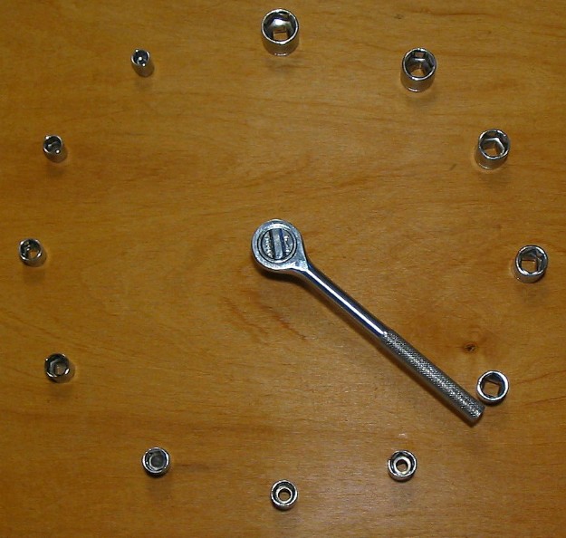
| nice shot & idea but where's the minute hand? No low score for it missing! 7 |
|
| Photographer found comment helpful. |
|
|
02/10/2004 07:58:01 PM |
| Nice idea, would have worked better with a solid background in my opinion. |
|
| Photographer found comment helpful. |
|
|
02/10/2004 07:49:57 PM |
| This would look better on a solid background without the bright flash spot. |
|
| Photographer found comment helpful. |
|
|
02/10/2004 11:31:27 AM |
| great use of sockets. I'll have to make one for real. |
|
| Photographer found comment helpful. |
|
|
02/09/2004 10:17:41 PM |
| oh dear another - i liked the other better due to the colours and the name, sorry |
|
| Photographer found comment helpful. |
|
|
02/09/2004 12:42:46 PM |
|
| Photographer found comment helpful. |
|
|
02/08/2004 11:12:02 PM |
|
| Photographer found comment helpful. |
|
|
02/08/2004 09:48:39 PM |
| there is only one hand on your clock |
|
|
|
02/07/2004 05:19:58 PM |
|
| Photographer found comment helpful. |
|
|
02/07/2004 01:29:25 AM |
|
| Photographer found comment helpful. |
|
|
02/06/2004 05:33:01 PM |
| under lit on the top, too much light on the bottom right. The idea is good, but the subject is too spread out for me. |
|
| Photographer found comment helpful. |
|
|
02/06/2004 04:22:51 PM |
| clean, simple and to the point. |
|
| Photographer found comment helpful. |
|
|
02/06/2004 10:16:25 AM |
| Cute concept. The glare on the bottom is slightly distracting though. |
|
| Photographer found comment helpful. |
|
|
02/06/2004 01:42:06 AM |
| very creative..i never would have thought of this |
|
| Photographer found comment helpful. |
|
|
02/06/2004 12:50:47 AM |
| Very nice system. I like how you have them in descending order. |
|
| Photographer found comment helpful. |
|
|
02/05/2004 12:57:48 PM |
| Interesting idea. The background (wood) looks a bit pale. Would have liked better lighting to eliminate the soft shadows on the "numbers" or go the other way and make the shadows more pronounced. |
|
| Photographer found comment helpful. |
|
|
02/05/2004 07:55:42 AM |
| Wood background was distracting, but, otherwise, good job on a great idea. |
|
| Photographer found comment helpful. |
|
|
02/05/2004 12:32:34 AM |
| Very creative shot! A little more symmetry in terms of size when placing the bolts would've helped I think, but overall a very good pic. Good luck. |
|
| Photographer found comment helpful. |
|
|
02/04/2004 02:55:53 PM |
| Perhaps too centered and straight on. I might have tried an offset shot with some angle. |
|
| Photographer found comment helpful. |
|
|
02/04/2004 11:51:47 AM |
| Nice idea, its 21 minutes, but what hour is it? :) |
|
| Photographer found comment helpful. |
|
|
02/04/2004 11:06:00 AM |
|
| Photographer found comment helpful. |
|
|
02/04/2004 09:53:26 AM |
| Fits the challenge. Lighting seems a little dark to me. I also wish there had been an "hour hand" to appear more clock-like - but that's just a personal opinion. I like the choice of the wood background. |
|
| Photographer found comment helpful. |
|
|
02/04/2004 08:20:15 AM |
| Nice idea and approach to the challenge. |
|
| Photographer found comment helpful. |
|
|
02/04/2004 12:59:05 AM |
|
| Photographer found comment helpful. |
|
|
02/04/2004 12:54:00 AM |
|
| Photographer found comment helpful. |
|
|
02/04/2004 12:30:18 AM |
| great concept... background is a bit dull...stone would have looked nicer |
|
| Photographer found comment helpful. |
Home -
Challenges -
Community -
League -
Photos -
Cameras -
Lenses -
Learn -
Help -
Terms of Use -
Privacy -
Top ^
DPChallenge, and website content and design, Copyright © 2001-2025 Challenging Technologies, LLC.
All digital photo copyrights belong to the photographers and may not be used without permission.
Current Server Time: 03/12/2025 09:55:25 AM EDT.