| Photograph Information |
Photographer's Comments |
Challenge: Impressionism II (Advanced Editing V*)
Collection: Portfolio
Camera: Nikon D200
Lens: Nikon AF Nikkor 50mm f/1.4D
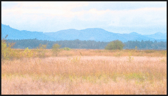
Location: Fern Ridge wildlife area, Eugene, OR
Date: Sep 3, 2007
Galleries: Blur, Photo-Impressionism
Date Uploaded: Sep 5, 2007
|
This semi-abandoned field is part of a wildlife area near a local lake. The dark hills are the inland beginning of Oregon's Coast Range Mountains. From the top of a concrete barrier at the edge of a parking lot, the view distills into an relaxing impression of the end of summer.
Crop, adjustment layers, touch of camera grain (lowest amount, reduce layer < 20% opacity), hint of canvas texture (lowest level, reduce to < 20% opacity), resize, add border.
------------Post voting
Thanks for the new personal best score and for the helpful comments. Interesting to see how widely spread the votes are - all through the challenge. I took over 100 shots of this scene trying to capture the play of light as a breeze gently moved the grasses. One shot had a couple of geese flying by, which could have added a place for the eye to center, but they were not in a good position. Although most impressionists had more contrast in colors, this image isn't so far off in palatte from selected works of Caillebotte . Learned a lot from making the image and from voting on the entries. |
| Author | Thread |
|
|
07/19/2009 07:35:01 AM |
I love the almost painting like style of this image. Beautiful soft pastel colors. This is definitely one to be proud off. I would enlarge, frame and hang on the wall for sure. Should have scored much higher imo.
Browsed your portfolio whilst i was here and i must say i like the diverse styles and quality much of your work exhibits.
Message edited by author 2009-07-19 07:36:13. |
|
 Photographer found comment helpful. Photographer found comment helpful. |
|
|
09/16/2007 11:15:52 AM |
looks like late summer, goes with soft palette
|
|
| Photographer found comment helpful. |
|
|
09/16/2007 09:16:34 AM |
| Love the soft tones. nice. |
|
| Photographer found comment helpful. |
|
|
09/15/2007 10:39:22 PM |
| I like the pastel shades in this too. The "Impressionism" challenge was a fun learning experience for everyone. Not to say that the scores couldn't have been better, but it seems that the perception of impressionism depends a lot on the individual and their experiences. I rather like seeing things not quite in focus sometimes, as in real life, we do not always have the time to see and focus on every scene that we see. Impressionism seems to cover that aspect of our life experiences well. |
|
| Photographer found comment helpful. |
|
|
09/14/2007 05:21:01 AM |
Originally posted by Monique64:
Colours are too soft. There needs to be more contrast of light and dark and of colours. |
I completly disagree, I think the soft colours works very well with the scenery, to me goves a feeling that its been painted using pastels. I did think it met the challenge very well, should've been higher than the 100ths places!!! |
|
| Photographer found comment helpful. |
Comments Made During the Challenge  |
|
|
09/11/2007 07:46:50 AM |
| I like the coulours here, I think the scenery suits it very well. Great stuff well done =) |
|
| Photographer found comment helpful. |
|
|
09/09/2007 07:31:47 PM |
| It has an impressionistic feel...but, the colors are very muted and it lacks an intersting subject. With some burning you could have brought out some of the textures...especially in the trees and the sky. |
|
| Photographer found comment helpful. |
|
|
09/09/2007 06:51:06 AM |
| Colours are too soft. There needs to be more contrast of light and dark and of colours. |
|
| Photographer found comment helpful. |
|
|
09/09/2007 12:15:28 AM |
|
| Photographer found comment helpful. |
|
|
09/08/2007 01:08:16 PM |
| I have spent considerable time looking at this photo and I am compelled to like it. I would like more blueness in the sky but then again it might be distracting to the image and it looks like a cloudy day anyway. |
|
| Photographer found comment helpful. |
|
|
09/07/2007 12:35:48 PM |
| Lovely pastel composition in the tradition of great impressionistic paintings. Very well done. I love the layering which gives great debth to the photo. Great control of the sky too. Maybe adding a foreground object would have increased the debth even more....8 |
|
| Photographer found comment helpful. |
Home -
Challenges -
Community -
League -
Photos -
Cameras -
Lenses -
Learn -
Help -
Terms of Use -
Privacy -
Top ^
DPChallenge, and website content and design, Copyright © 2001-2025 Challenging Technologies, LLC.
All digital photo copyrights belong to the photographers and may not be used without permission.
Current Server Time: 03/10/2025 06:19:41 PM EDT.