| Author | Thread |
Comments Made During the Challenge  |
|
|
09/22/2002 10:48:00 PM |
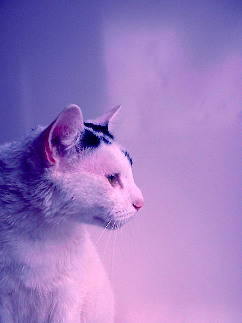
| I like your use/control of DOF and the interesting color effect -- I'd be interested in knowing how you did it and seeing the before/after versions. |
|
|
|
09/22/2002 06:09:00 PM |
| Not a bad composition... I'm afraid the blue/red tint takes a lot away from this shot. Some color adjustments would have made a lot of difference for this one. |
|
|
|
09/22/2002 12:22:00 PM |
| I liked the way the magenta colour cast adds to the feel and mood of the picture. |
|
|
|
09/20/2002 03:18:00 PM |
| I am going to assume you wanted the pink cast to this picture (if not, maybe adjust white balance), but I am not sure what it may add to the picture. How did it look with true whites and blacks -- or even as a bw photo? karmat |
|
|
|
09/20/2002 02:54:00 PM |
| The coloring is way too blue and looks unnatural. This can easily be corrected in any photo editing program. The kitty is beautiful and I like this profile shot. Also meets the negative space criteria. Good luck in the challenge. Grayce aka Gracious |
|
|
|
09/20/2002 01:13:00 PM |
| very grainy multihued nonuniform background, I am not sure if that does it for me with 'neg space.' |
|
|
|
09/20/2002 12:00:00 PM |
I like the colours here, and the paint-stroke effect of the background is attractive. Seems very pixelated, I do understand this may because of resizing or low resolution camera.
6, Kavey |
|
|
|
09/20/2002 03:17:00 AM |
| What's the cat staring at? This looks kinda wierd with the pink light. 4 |
|
|
|
09/19/2002 04:31:00 PM |
| Good photo. Not sure about the pink cast though. going with 6 but would go higher if the color balance was better. |
|
|
|
09/19/2002 04:19:00 PM |
(i'm only making quick comments for scores 8+..sorry)
This is a great photo. I love the colors and the texture. I detect some post-processing...I like it. However, one small tiny thing, it appears to be over sharpened/contrasted, where as the nice soft flowing texture of the image is interrupted by small areas in the fur - especially along the edges of the cat's head and whiskers. (only my observation) 8
Ruthann |
|
|
|
09/18/2002 07:56:00 PM |
| Is the cat white with black markings? I have a fairly well adjusted monitor and the whole photo seems on the pinkish/purple side? 7 Swash |
|
|
|
09/18/2002 02:06:00 AM |
Composition: 5Lighting: good 5,
Appeal: 5, Total Rating 5 Sulamk
|
|
|
|
09/17/2002 03:20:00 PM |
| Good idea...however,the purple cast distracts form the picture, IMO |
|
|
|
09/17/2002 04:47:00 AM |
| I like how the cat is detached from the background. Challenge : ok. Composition .... I think it would have been better done a different way. Did you try different cropping ? it is too mucj centered on the vertical direction to my taste. 6 |
|
|
|
09/16/2002 11:44:00 PM |
| I know, I know... lemme guess... cat owners will COMPLETELY get this picture. But boy do I hate cats. hehe I really like the colors. Good job! - bamaster (7) |
|
|
|
09/16/2002 09:56:00 PM |
| I love the coloring on this. 9 |
|
|
|
09/16/2002 06:15:00 PM |
|
|
|
09/16/2002 04:16:00 PM |
| I think a more colour corrected version of this image might have been more effective. It's great that the cat is looking into the negative space. Gives it a reason for being there |
|
|
|
09/16/2002 03:05:00 PM |
| Fantastic catch of good expression. Cats....love them. Could of been sharper, more focus. Score 6 Justine |
|
|
|
09/16/2002 01:46:00 PM |
| nice color! is s/he wet? sgtpepper6344 |
|
|
|
09/16/2002 11:08:00 AM |
I'm not sure I care for the dominent redish tone, but I gave this picture a 10 because of two things:
First & foremost, the NegSpc *does* say "wow" and compliemtns the overall pic.
Second, the subject is well chosen, poised and framed. |
|
Home -
Challenges -
Community -
League -
Photos -
Cameras -
Lenses -
Learn -
Help -
Terms of Use -
Privacy -
Top ^
DPChallenge, and website content and design, Copyright © 2001-2025 Challenging Technologies, LLC.
All digital photo copyrights belong to the photographers and may not be used without permission.
Current Server Time: 03/14/2025 01:03:03 AM EDT.