| Author | Thread |
|
|
09/24/2007 06:59:57 PM |
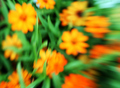
| Nice sectioning of color groups moving back through the frame. The bright bit of dirt in the front left distracts a bit, maybe crop out a teeny bit off the bottom? The most impressionistic looking part, to me, is that strip of whites and reds - the background greenery looks almost pontillistic. |
|
 Photographer found comment helpful. Photographer found comment helpful. |
|
|
09/14/2007 11:03:29 AM |
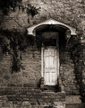
Don
Nice photo,I would have liked to see this on the darker side.
Message edited by author 2007-09-14 11:03:49. |
|
| Photographer found comment helpful. |
|
|
09/14/2007 12:20:15 AM |
| A pretty image, Don. Ironically, I think people might've voted this down because it had sharp areas! Good for you for not just applying PS filters to make it look like a painting. |
|
| Photographer found comment helpful. |
Comments Made During the Challenge  |
|
|
09/13/2007 12:28:50 AM |
|
| Photographer found comment helpful. |
|
|
09/09/2007 11:19:08 AM |
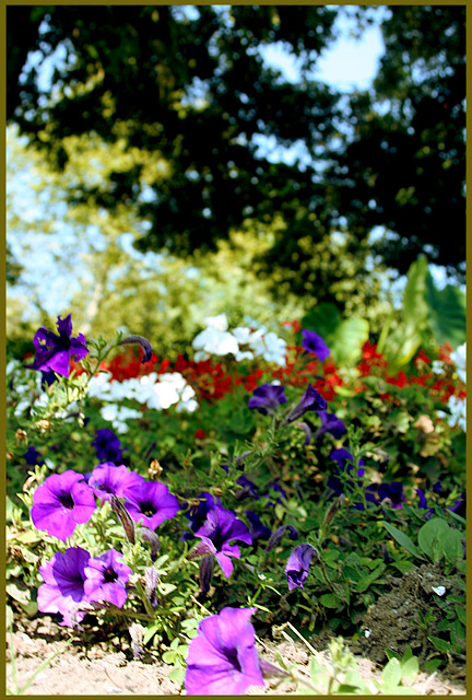
| Nice colors, the tree above is almost too dark for the colors below, kinda makes it unbalanced, and also how the top is more blurred than the bottom, would have liked to see some brush strokes or some type of artist effect/filter. |
|
| Photographer found comment helpful. |
|
|
09/09/2007 06:08:27 AM |
| Good idea but am finding the shot over exposed. |
|
| Photographer found comment helpful. |
Home -
Challenges -
Community -
League -
Photos -
Cameras -
Lenses -
Learn -
Help -
Terms of Use -
Privacy -
Top ^
DPChallenge, and website content and design, Copyright © 2001-2025 Challenging Technologies, LLC.
All digital photo copyrights belong to the photographers and may not be used without permission.
Current Server Time: 03/10/2025 10:37:11 PM EDT.