| Author | Thread |
Comments Made During the Challenge  |
|
|
09/22/2002 10:17:00 PM |
| Your pic is nice. The only problem is: it's in dead center. That's photo no-no. Why? because it is not as pleasing to the eye than if were off-centered. This is called the rule of thirds. So if you off-center it a little your pic above will get higher ratings. Good luck. |
|
|
|
09/22/2002 04:16:00 PM |
| The crystal ornament is too dark for my liking, which makes it hard to see against the black background. |
|
|
|
09/22/2002 03:07:00 AM |
| It's head is a little dark. 5 |
|
|
|
09/20/2002 08:31:00 PM |
| Sure there's negative space, but this doesn't really interest me and I'm not particularly fond of the composition. Try to work on different angles to make the photograph a little more interesting. |
|
|
|
09/20/2002 03:35:00 PM |
|
|
|
09/20/2002 02:50:00 PM |
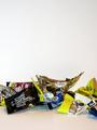
| don't know if it was possible, but boosting the contrast might get rid of the folds of your background. it may totally obliterate teh cat though, (?) Did you try placing it in different parts of the picture, other than center? karmat |
|
|
|
09/19/2002 01:25:00 PM |
This is an interesting idea... i don't particularly care much for the dead center view of thei subject though... Off center to one side or the other would appeal to me in a much stronger way....
Meets Challenge: 10
Technical Merit: 5
Artistic Merit: 7
Creative Merit: 7
WOW Factor: 5
Score: 7 - JMSetzler |
|
|
|
09/19/2002 10:35:00 AM |
| A cat...Who is not a cat....interesting... |
|
|
|
09/19/2002 08:21:00 AM |
| Not enough definition, not enough thought behind it, boring NS, boring subject...sorry...2 ...it's also out of focus |
|
|
|
09/18/2002 08:15:00 PM |
| interesting concept, but it would be better if the kitty face had more definition. better lighting, maybe? |
|
|
|
09/18/2002 08:00:00 PM |
| I like that you found a transparency to fulfill the negative space requirement. Nice light reflections and lack thereof. |
|
|
|
09/18/2002 08:11:00 AM |
| Love the light refractions against the black background but the subject needed to be off to one side I think to make use of your negative space better. 8 - floyd |
|
|
|
09/17/2002 06:54:00 AM |
Composition: 5 Lighting: good 4
Appeal: 6 Total Rating 5 Sulamk
|
|
|
|
09/16/2002 09:12:00 PM |
|
|
|
09/16/2002 04:35:00 PM |
| Great attempt! Try moving the figurine off center for more impact |
|
|
|
09/16/2002 03:12:00 PM |
| Can't make out enough detail on the figurine, but this seems to meet the challenge! Good luck in the challenge. Grayce aka Gracious |
|
|
|
09/16/2002 07:19:00 AM |
| I like the crystal, the reflections a well hadnled. I think thought i's too much center and facing the camera and I would prefer a full black background. Somebody already submited a picture taken in fron of a black drape last week (you ?) and I thought the same thing. You could try to reduce the brigness a little to see the results. Maybe you tried but still picked that one. 5 |
|
Home -
Challenges -
Community -
League -
Photos -
Cameras -
Lenses -
Learn -
Help -
Terms of Use -
Privacy -
Top ^
DPChallenge, and website content and design, Copyright © 2001-2025 Challenging Technologies, LLC.
All digital photo copyrights belong to the photographers and may not be used without permission.
Current Server Time: 03/12/2025 08:04:07 PM EDT.