| Author | Thread |
Comments Made During the Challenge  |
|
|
02/10/2004 04:19:54 PM |
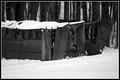
| i like the composition, no detail in he leather though! |
|
 Photographer found comment helpful. Photographer found comment helpful. |
|
|
02/09/2004 09:55:44 PM |
|
| Photographer found comment helpful. |
|
|
02/09/2004 08:36:08 PM |
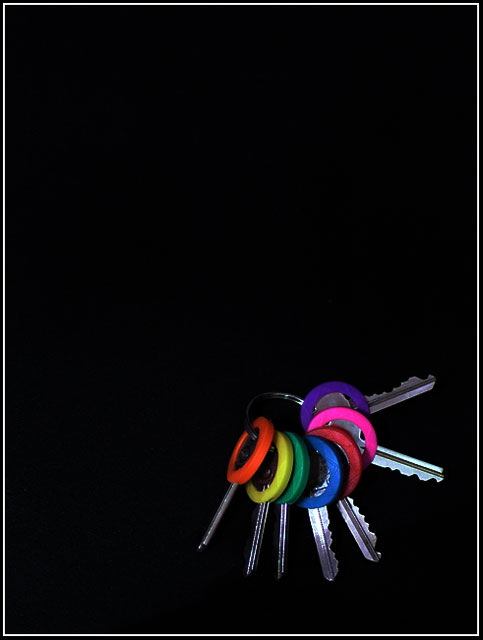
| I love the black! Anyone who says there is too much black lacks creativity. 8 |
|
| Photographer found comment helpful. |
|
|
02/09/2004 05:21:06 PM |
| Atractive photo. Keys would benefit from being sharper though... |
|
| Photographer found comment helpful. |
|
|
02/07/2004 09:35:08 PM |
| I think of a pink floyd album cover... too much black, not enough interest. |
|
| Photographer found comment helpful. |
|
|
02/07/2004 08:47:21 PM |
| I've seen this before. I think I caught this on Pbase. Good use of negative space, but the keys are a bit dark. I like the idea. |
|
| Photographer found comment helpful. |
|
|
02/07/2004 01:20:39 AM |
| BW would have been preferable. and the frame may look better with the keys a little more towrds the center. |
|
| Photographer found comment helpful. |
|
|
02/06/2004 02:32:11 AM |
| I like this image, even with all that negative space. But the lighting on the keys has to be perfect to pull this off, and I think it needs improvement. |
|
| Photographer found comment helpful. |
|
|
02/04/2004 09:44:01 PM |
| to much black needs to be cut down more, nice idea though |
|
| Photographer found comment helpful. |
|
|
02/04/2004 05:05:19 PM |
| Like the setup but I think it needs more light. |
|
| Photographer found comment helpful. |
|
|
02/04/2004 12:48:54 PM |
| Keys lost in the garage? Maybe? |
|
| Photographer found comment helpful. |
|
|
02/04/2004 12:06:49 PM |
| Love the vibrant colors but don't get a really strong "garage" feel. I would have also probably cropped it tighter. |
|
| Photographer found comment helpful. |
|
|
02/04/2004 10:17:19 AM |
| I like this idea alot for the challenge. I like the simplicity and the colors and the lighting. . I think the empty area (is that what's referred to as "negative space?") is a bit much though. I would have like this cropped down just a bit. Good job on shooting this one though. |
|
| Photographer found comment helpful. |
|
|
02/04/2004 10:14:18 AM |
| Too much negative space, not enough lighting. |
|
| Photographer found comment helpful. |
|
|
02/04/2004 08:25:01 AM |
| Nice composition and interesting use of negative space. |
|
| Photographer found comment helpful. |
|
|
02/04/2004 05:40:35 AM |
| This is the photo that grabbed my eye from the thumbnails. Excellent. I am sure that will be a ribbon. You might have a few complains about the negative space though. 10 from me. |
|
| Photographer found comment helpful. |
|
|
02/04/2004 03:25:53 AM |
|
| Photographer found comment helpful. |
|
|
02/04/2004 12:26:21 AM |
| Very professionally presented. How about leather texture? |
|
| Photographer found comment helpful. |
Home -
Challenges -
Community -
League -
Photos -
Cameras -
Lenses -
Learn -
Help -
Terms of Use -
Privacy -
Top ^
DPChallenge, and website content and design, Copyright © 2001-2025 Challenging Technologies, LLC.
All digital photo copyrights belong to the photographers and may not be used without permission.
Current Server Time: 04/25/2025 02:18:26 PM EDT.