| Author | Thread |
Comments Made During the Challenge  |
|
|
10/07/2007 01:20:14 PM |
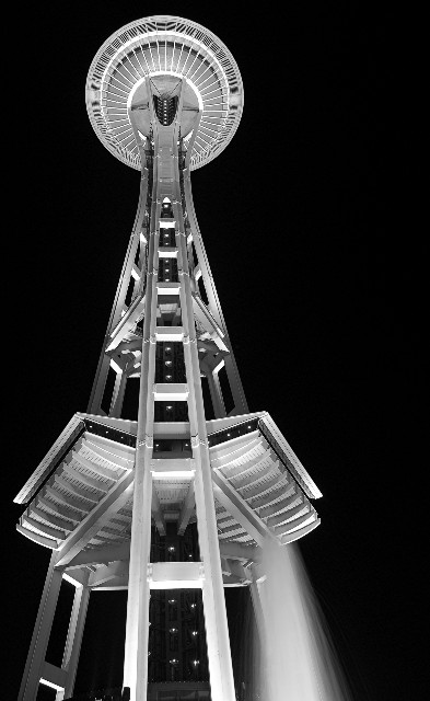
| Nice black and white. Interesting design. I would have moved it just a little bit more to the right but still keep it off center. |
|
 Photographer found comment helpful. Photographer found comment helpful. |
|
|
10/05/2007 03:14:52 PM |
| A nice bold night shot. The compression down to 640 pixels gives it a badly stair-stepped look, though. Perhaps resizing with a different sampling method may have smoothed it out a bit. |
|
| Photographer found comment helpful. |
|
|
10/05/2007 01:24:06 PM |
|
| Photographer found comment helpful. |
|
|
10/05/2007 10:17:09 AM |
|
| Photographer found comment helpful. |
|
|
10/04/2007 10:50:53 PM |
| Very cool view of the needle. I really like the fact its in black & white - it works well. Maybe a tad over sharpened, but still very nice. Good luck in the challenge. |
|
| Photographer found comment helpful. |
|
|
10/04/2007 02:22:35 AM |
| avg vote, the right bottom leg blurred looks strange and stands out, top part as an affect (not sure what to call it , like seeing black and white or plaid on tv) |
|
| Photographer found comment helpful. |
|
|
10/03/2007 11:40:30 PM |
|
|
|
10/02/2007 06:41:02 AM |
| There seems to be noise around the tower created by the editing process. Not overly sure how much you could get away with cloning out, but to me it is a noticable distraction. |
|
| Photographer found comment helpful. |
|
|
10/01/2007 10:06:52 PM |
| Very nice contrast and clarity. Perhaps a bit over-sharpened |
|
| Photographer found comment helpful. |
|
|
10/01/2007 07:50:24 PM |
| Nice view of the Needle. Only what is the movement on lower right, kind of distracting. |
|
| Photographer found comment helpful. |
|
|
10/01/2007 10:00:19 AM |
| Love the tones, the contrast and the geometry here. The lines look a bit dotted throughout, maybe too much sharpenning? |
|
| Photographer found comment helpful. |
|
|
10/01/2007 12:06:49 AM |
| I'd vote higher if it was centered.nice shot |
|
| Photographer found comment helpful. |