| Author | Thread |
|
|
09/24/2007 02:01:40 PM |
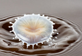
I like this one better than the original one.
Techo's one was better regarding symmetry, but to me the DOF and contrast are better in your one. |
|
 Photographer found comment helpful. Photographer found comment helpful. |
Comments Made During the Challenge  |
|
|
09/23/2007 11:49:08 AM |
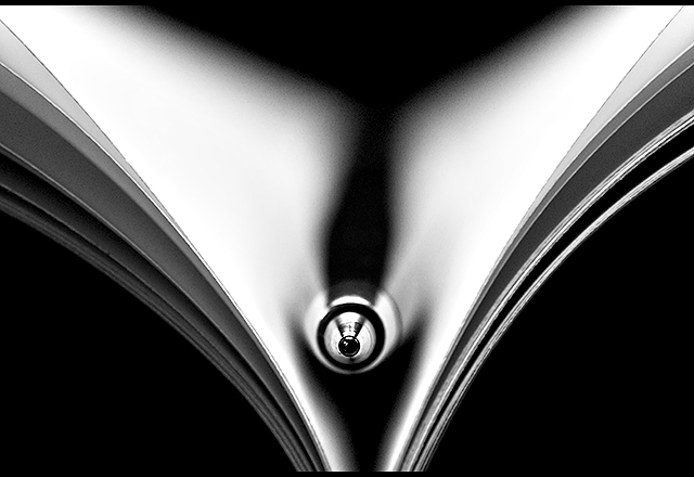
| Very good attempt...I bet getting the pages "just right" was a nightmare! |
|
| Photographer found comment helpful. |
|
|
09/23/2007 02:38:45 AM |
| Very good attempt...but watch the focal length/aperture to keep some definition in the pen. |
|
| Photographer found comment helpful. |
|
|
09/21/2007 10:07:31 AM |
| Great tones and contrast. Excellent rendition. 9 |
|
| Photographer found comment helpful. |
|
|
09/20/2007 08:55:35 PM |
|
| Photographer found comment helpful. |
|
|
09/20/2007 10:20:23 AM |
| Wow, great job in emulating the original. Tis a great rendition but it could be spectacular if just a few things were done. First, I think it would increase visual impact if you increase the DOF in the shot. It would show more details along the length of this pen. As it stands now the only portion in sharp detail is the point of the pen. If you notice the photo info on Techo's version he used an aperture of 8 and a low shutter speed of 1/15. By doing so, he increased his Depth of Field so that not only the foreground is in sharp detail but the background is too. Next I think that spreading the pages out more so they are not clumped in bunches adds more clean lines to the photo that will make it more visually appealing. |
|
| Photographer found comment helpful. |
|
|
09/19/2007 12:34:09 AM |
| Like the original. Very compelling. 8 |
|
| Photographer found comment helpful. |
|
|
09/18/2007 11:44:41 PM |
| I like these shots for the clean crisp symmetry, and strong contrast. Nicely done. |
|
| Photographer found comment helpful. |
|
|
09/18/2007 06:34:12 AM |
| Good rendition of Techo's shot. good lighting, good b/w conversion. Your POV is slightly lower, overall it seems you didn't put as much effort in the shot, the spreading of pages is less elegant and symmetric, your DOF is too shallow, the tip of the pen hasn't got the graphic quality Techo's has. |
|
| Photographer found comment helpful. |
|
|
09/17/2007 10:17:24 PM |
| I was going to do this one to but then I remembered I didn't have a good Macro Lens hehe. Great work |
|
| Photographer found comment helpful. |
|
|
09/17/2007 08:06:27 PM |
| Nice try -- very close. The light/contrast on the original was softer and more pleasing, and the pen was more visible. Still this is an interesting image. |
|
| Photographer found comment helpful. |
|
|
09/17/2007 01:13:01 PM |
I was going to try this one, but never got around to it. Glad I didn't, as you would have completely embarrassed me.
Very nicely done. |
|
| Photographer found comment helpful. |
|
|
09/17/2007 05:02:55 AM |
|
| Photographer found comment helpful. |
Home -
Challenges -
Community -
League -
Photos -
Cameras -
Lenses -
Learn -
Help -
Terms of Use -
Privacy -
Top ^
DPChallenge, and website content and design, Copyright © 2001-2025 Challenging Technologies, LLC.
All digital photo copyrights belong to the photographers and may not be used without permission.
Current Server Time: 03/10/2025 09:24:10 PM EDT.