| Author | Thread |
Comments Made During the Challenge  |
|
|
09/22/2002 08:04:00 PM |
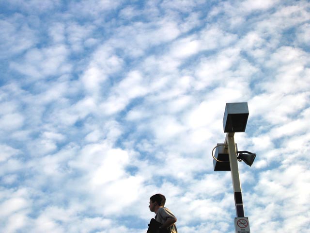
| Incredible sky and meets the challenge. Not terribly interesting to me. But so what! :-) Good luck in the challenge! Grayce aka Gracious |
|
|
|
09/21/2002 06:09:00 PM |
| Could be great without the lamppost. 8 |
|
|
|
09/21/2002 01:42:00 AM |
| Nice sky. I don't like the light thing in the shot. 4 |
|
|
|
09/20/2002 02:42:00 PM |
| neg space not pronounced at all |
|
|
|
09/18/2002 04:36:00 PM |
| i would have cropped out the light post. |
|
|
|
09/18/2002 03:27:00 PM |
| Good colors and lighting and I love the perspective in this. Definitely gets your attention. karmat |
|
|
|
09/18/2002 02:21:00 PM |
| If the person weren't in this, I'd love it. The sky is a little too even, maybe some levelling would have fixed that. Good job though. |
|
|
|
09/18/2002 12:31:00 PM |
I would like to see more of the man. Neg space to me doesnt mean object has to be dwarfed in the frame by the background. Like the upward looking angle.
5, Kavey |
|
|
|
09/18/2002 01:32:00 AM |
Composition: 5 Lighting: good 5,
Appeal: 5, Total Rating 5 Sulamk
|
|
|
|
09/17/2002 05:31:00 PM |
| Should've cropped out the street light, otherwise very nice |
|
|
|
09/17/2002 06:44:00 AM |
|
|
|
09/17/2002 02:20:00 AM |
| Ok which one is the subject? |
|
|
|
09/16/2002 09:01:00 PM |
| so, i like this one (albeit less controversial than the last ;) ) -- the clouded sky makes a great backdrop for the negative space theme...empty but adds interesting texture to the photo (although i'd like to see it w/ @10% less sky at the top). at the same time, the increasing diagonals of the post & arm add nice energy, on the verge of motion. might look nice as a b&w as well, adding an ominous tone... good job :) |
|
|
|
09/16/2002 08:11:00 PM |
| i'm a sucker for clouds. they add so much to your shot. |
|
|
|
09/16/2002 06:44:00 PM |
| i know ur sick of reading this but, u should've cropped the post... |
|
|
|
09/16/2002 05:59:00 PM |
| the clouds are very nice but the subjects of the photo are lacking in interest. |
|
|
|
09/16/2002 12:52:00 PM |
| I think that I would have preferred this shot with just the person and not the lightpost - would have made him seem as though he was floating. I really like the cloud backdrop, though. |
|
|
|
09/16/2002 10:19:00 AM |
Meets the challenge well. Two MINOR remarks: the man-/-post were better lit or totally dark---also---the lamp post is leaning. I do like this and love that sky. Good work.
Score 6. Justine |
|
Home -
Challenges -
Community -
League -
Photos -
Cameras -
Lenses -
Learn -
Help -
Terms of Use -
Privacy -
Top ^
DPChallenge, and website content and design, Copyright © 2001-2025 Challenging Technologies, LLC.
All digital photo copyrights belong to the photographers and may not be used without permission.
Current Server Time: 03/13/2025 02:23:41 AM EDT.