| Author | Thread |
Comments Made During the Challenge  |
|
|
10/07/2007 06:13:23 PM |
|
|
|
10/07/2007 12:27:19 PM |
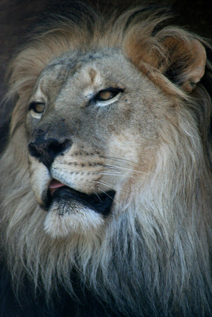
| He seems a little on the pale side - color saturation wise. I do like the little bit of tongue sticking out - its funny. |
|
|
|
10/06/2007 11:06:01 AM |
| Its a good lion portrait. Increasing saturation would give it more punch and life. |
|
|
|
10/05/2007 02:47:48 PM |
| The colors are flat and it looks out of focus. Would have been much more dramatic if the lion had been looking at the camera. But I know animals are not always cooperative. |
|
|
|
10/03/2007 11:35:16 PM |
| The eyes are kind of freaky and funny that you caught the tongue. To me this seems to be a bit out of focus. And to put greater emphasis on the face, I would like to have seen a better contrast between light and dark. |
|
|
|
10/02/2007 08:52:39 PM |
| Love the nice tight crop. |
|
|
|
10/02/2007 04:54:49 AM |
| very good crop, but lacking of sharpness. white balance seems to be wrong. |
|
|
|
10/01/2007 11:34:09 PM |
|
|
|
10/01/2007 05:26:50 PM |
| Cool shot, to me the left eye looks OOF. Maybe some color curves...the colors seem slightly flat to me. |
|
|
|
10/01/2007 03:17:54 PM |
| Oh I really wish this were a bit sharper, it's a gorgeous portrait. |
|
|
|
10/01/2007 01:46:30 PM |
| lack of technicle quality 4 |
|
|
|
10/01/2007 07:13:53 AM |
| looks like you cropped quite a bit. I 'm missing sharpness. |
|
|
|
10/01/2007 05:15:09 AM |
| looks a bit soft to me but the mane looks great |
|
Home -
Challenges -
Community -
League -
Photos -
Cameras -
Lenses -
Learn -
Help -
Terms of Use -
Privacy -
Top ^
DPChallenge, and website content and design, Copyright © 2001-2025 Challenging Technologies, LLC.
All digital photo copyrights belong to the photographers and may not be used without permission.
Current Server Time: 03/12/2025 02:59:10 PM EDT.