| Author | Thread |
|
|
02/20/2009 08:29:55 PM |
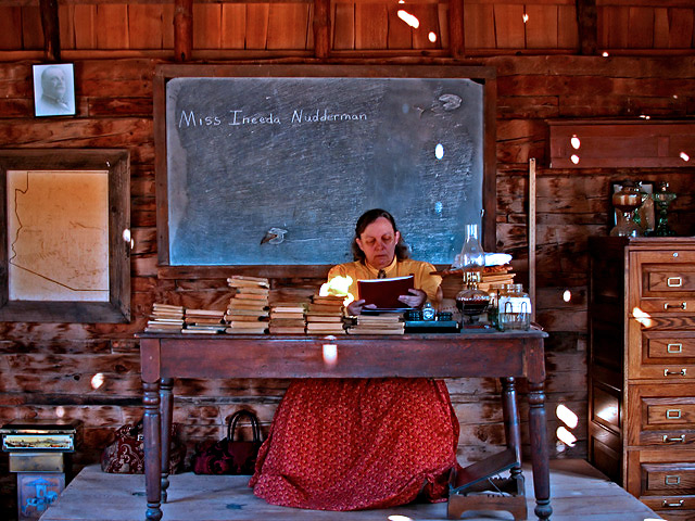
| Is this in ND? If it is my mother probably attended a school very much like this...a few years later (only 40) but things out there don't change much!! |
|
 Photographer found comment helpful. Photographer found comment helpful. |
|
|
10/08/2007 01:34:10 AM |
| What a fun image, and a nice finish, Barbara! |
|
| Photographer found comment helpful. |
Comments Made During the Challenge  |
|
|
10/07/2007 06:19:02 PM |
| Nice tableau. You're probably getting dinged for those splotches of light, but that's my favorite part. |
|
| Photographer found comment helpful. |
|
|
10/07/2007 10:52:44 AM |
| The spots of light are a little distracting, but overall a pleaseing image. May have been better with a little more light on her face, not sure how much control you had over that, though. (PS perhaps?) |
|
| Photographer found comment helpful. |
|
|
10/07/2007 12:36:15 AM |
| ha, ha, ha on her name. For me, when I crop out the file cabinet on the far right, I like your image better. It seems too new for the rest of the image. |
|
| Photographer found comment helpful. |
|
|
10/05/2007 03:42:14 PM |
| The patches of lilght everywhere are distracting as well as the color effect. Otherwise a good photo. |
|
| Photographer found comment helpful. |
|
|
10/05/2007 01:52:36 PM |
|
| Photographer found comment helpful. |
|
|
10/04/2007 08:31:49 AM |
| Pity those white sploches are all over the photo. I would have also liked to see a much tighter crop and maybe change the angle from front on. |
|
| Photographer found comment helpful. |
|
|
10/03/2007 07:46:52 PM |
| Very well componsed. Nice warm colors. |
|
| Photographer found comment helpful. |
|
|
10/03/2007 06:04:42 PM |
|
| Photographer found comment helpful. |
|
|
10/03/2007 07:38:49 AM |
Goodness what a fearsome looking woman! With a teacher like her I think I may have concentrated a touch more at school.
I presume this is a reconstructed living-village from the 19th Century. I do like the composition although the light spots are a little distracting. Very nice almost muted colours help emphasise the 'age' of the scene. I am both glad that you avoided going for sepia (which would have perhaps been a little too obvious) and at the same time intrigues as to what it would look like as a sepia shot
Good composition and I like the fact that whilst it is centred the fact that Miss Nutterman is sitting to one side and the books are stacked to the other means that it is asymettrical
Nice shot |
|
| Photographer found comment helpful. |
|
|
10/02/2007 11:06:28 PM |
| The title says it all. Well done. |
|
| Photographer found comment helpful. |
|
|
10/02/2007 10:48:58 AM |
| WOW - if it were in sepia, it'd really look authentic!!! |
|
| Photographer found comment helpful. |
|
|
10/01/2007 09:24:36 PM |
| well, you are clever! LOL! |
|
| Photographer found comment helpful. |
|
|
10/01/2007 01:27:01 PM |
|
| Photographer found comment helpful. |
|
|
10/01/2007 08:48:21 AM |
| Overall I really like the shot, I wish her face was a little clearer but that is just a small point. Nice colours and comp. 7 |
|
| Photographer found comment helpful. |
|
|
10/01/2007 07:14:57 AM |
| the lightspots of the sun bother me. It could've used some PP to get that really old picture feeling. |
|
| Photographer found comment helpful. |
|
|
10/01/2007 02:31:59 AM |
| I can appreciate the effort that was put in to this image. |
|
| Photographer found comment helpful. |
Home -
Challenges -
Community -
League -
Photos -
Cameras -
Lenses -
Learn -
Help -
Terms of Use -
Privacy -
Top ^
DPChallenge, and website content and design, Copyright © 2001-2025 Challenging Technologies, LLC.
All digital photo copyrights belong to the photographers and may not be used without permission.
Current Server Time: 03/16/2025 05:23:31 AM EDT.