| Author | Thread |
Comments Made During the Challenge  |
|
|
10/05/2007 04:34:32 PM |
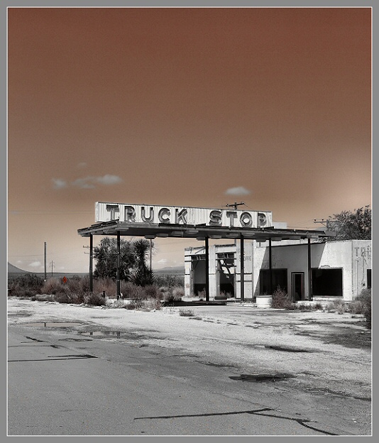
| don't particularly care for the grey border. And not sure about the composition. nice toning, and interesting take on the mundane. |
|
 Photographer found comment helpful. Photographer found comment helpful. |
|
|
10/04/2007 01:58:18 PM |
| Love what you did to the sky! Very nicely done! |
|
| Photographer found comment helpful. |
|
|
10/04/2007 01:23:39 PM |
| Very nice shot but I would like to see the sky without the sepia toning. I also like the little bit of red. |
|
| Photographer found comment helpful. |
|
|
10/04/2007 08:10:22 AM |
|
| Photographer found comment helpful. |
|
|
10/04/2007 04:33:07 AM |
| Love what you did with the processing (and the border compliments that nicely). |
|
| Photographer found comment helpful. |
|
|
10/04/2007 12:54:54 AM |
| avg vote, i like the tone and teh feel of the picture. The horizon is a little blown along with tree (middle, far right). The building isn't appealing though, just looks like walls.. looking for something to set the era more. |
|
| Photographer found comment helpful. |
|
|
10/03/2007 10:21:55 PM |
| I'm sure I've seen this place in many locations. The duotone is interestingly effective. Did you try it in the other half, with a gray sky? |
|
| Photographer found comment helpful. |
|
|
10/03/2007 07:29:01 PM |
| I'd like this more with a little less foreground asphalt. |
|
| Photographer found comment helpful. |
|
|
10/03/2007 02:54:06 PM |
| I like this alot well done. |
|
| Photographer found comment helpful. |
|
|
10/03/2007 10:00:40 AM |
| what a cool old abandoned truck stop ... I'll bet you've got some great shots from this location ... normally I'm not a huge fan of colored borders, but this time it works well ... nice job |
|
| Photographer found comment helpful. |
|
|
10/02/2007 10:50:35 AM |
| Nice use of selective desat. |
|
| Photographer found comment helpful. |
|
|
10/02/2007 03:37:28 AM |
| interesting scenery. nice color conversion. composition is too centered, might have been better if you had shot from a lower viewpoint to include more of the road. had used a white border to make the image "pop" some more |
|
| Photographer found comment helpful. |
|
|
10/01/2007 09:48:00 PM |
| I like the use of the b/w and sepia sky. It works well for this subject. |
|
| Photographer found comment helpful. |
|
|
10/01/2007 01:41:08 PM |
|
| Photographer found comment helpful. |
|
|
10/01/2007 10:18:38 AM |
| Do not like that color sky - perhaps a different color would work better - 7 |
|
| Photographer found comment helpful. |
Home -
Challenges -
Community -
League -
Photos -
Cameras -
Lenses -
Learn -
Help -
Terms of Use -
Privacy -
Top ^
DPChallenge, and website content and design, Copyright © 2001-2025 Challenging Technologies, LLC.
All digital photo copyrights belong to the photographers and may not be used without permission.
Current Server Time: 03/14/2025 01:02:58 PM EDT.