| Author | Thread |
|
|
10/22/2007 01:17:15 PM |
| yeah, I was one of your many 5s.... Personally I like the "noise" and the "softness". It looks like a drawing/painting. What I didn't like was the static composition, the big head taking up most of the frame in perfect centerhood. I realize that the challenge pushed you in that direction, so I understand your choice. That's probably why I voted the whole challenge so low. Very few macros appeal to me. Most of them seem to be saying "look at how cool my lens is!" At least you didn't have that problem. ;) |
|
 Photographer found comment helpful. Photographer found comment helpful. |
|
|
10/22/2007 12:55:45 PM |
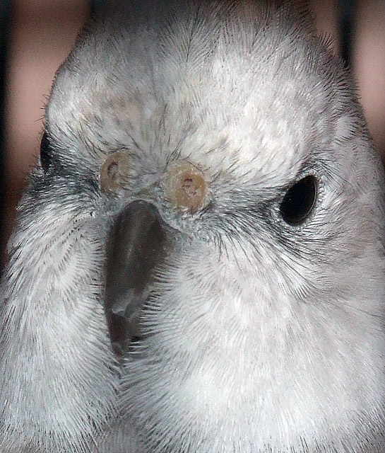
| Most of the comments left cover how I felt. There seems to be a shadow vertical across the body which is distracting. The background is also distracting. Next time, try to get the eye in focus, if he had turned his head a little more, it might have helped the score. |
|
| Photographer found comment helpful. |
|
|
10/22/2007 12:02:13 PM |
Hi Kelli,
I believe that part of the average score is the crop, the noise and the jpg artifacts due to either over sharpening or cropping a small picture and enlarging it too much. With the crop normally here at DPC voters are overly concerned if you don't try to follow the rules of thirds. I don't necessarily agree that thirds is alway the right answer but DPC'rs think so. Several areas on the bird inclusing the feathers and also areas outside the bird shows a lot of smooth noise. The individual feathers have significant artifacts or jaggies. This could be because of over sharpening or cropping in very close. I also have had some very poor scores that make me scratch my head. Don't let them get under your skin, if you like it then thats what is important. Best of Luck |
|
| Photographer found comment helpful. |
|
|
10/22/2007 12:01:18 PM |
I agree - in the context of this challenge, this looks like an oversharpened crop rather than a full-frame close-up. And the difference in the details/noise.
From an aesthetic/wow perspective, this just doesn't strike me as something of great interest. I didn't vote on this, but probably would have voted 5 as well. Maybe it's the lack of color variation, maybe it's the odd tilt, I can't really put my finger on it.
Hope this helps!
Cheers,
-Jeff |
|
| Photographer found comment helpful. |
|
|
10/22/2007 11:39:49 AM |
Give it a shot for you, first thing I notice when looking at pic is the two pronounced white spots above and below the left eye, seem to draw my attention immediatly and distract from the photo, personal opinion is it would have done a bit better with a profile rather than a head on shot. I did not vote but would probably have scored this a six, a little above average photo. As always, these are my opinions, and they are worth probably what you paid for them! LOL
Jacque |
|
| Photographer found comment helpful. |
|
|
10/22/2007 11:34:48 AM |
Hi Kelli. I voted 6 on this. I like the composition, and there's a reasonable amount of detail in the feathers.
However, to really crank up the score, you need amazing detail. Compare the sharpness of this to the top scorers. I'm not talking sharp for the sake of being sharp, but how it adds detail.
This may be a case where your camera's lens is limiting you.
It's also pretty noisy. That didn't bother me too much, but some people will drop you hard for it. Looking at the beak, actually, do you see the little specks? That's either noise or what's left over sometimes from too much sharpening after noise reduction.
Finally, the eyes look dead because there's no light, no iris, and no catchlights. |
|
| Photographer found comment helpful. |
Home -
Challenges -
Community -
League -
Photos -
Cameras -
Lenses -
Learn -
Help -
Terms of Use -
Privacy -
Top ^
DPChallenge, and website content and design, Copyright © 2001-2025 Challenging Technologies, LLC.
All digital photo copyrights belong to the photographers and may not be used without permission.
Current Server Time: 03/14/2025 06:27:04 PM EDT.