| Author | Thread |
|
|
02/21/2004 12:53:14 PM |
**Critique Club**
Hi Anne!
Positives:
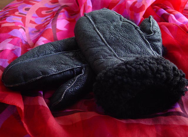
The lighting seems to be fairly good, and you have the mittens focused well.
Possible Improvements:
I have to agree with the other comments below that the background just does not work here. I would have used some sort of a solid background that was a lighter shade, to give more contrast. The crop does not seem to be uniform. Also, the top left corner is a distraction.
Overall just an unintersting subject, I'm sorry to say. Good luck in your future entries.
Regards,
-Chris |
|
Comments Made During the Challenge  |
|
|
02/19/2004 11:28:18 PM |
| The colored background helps emphasize the black in the mittens. I think it could use a little sharpening. |
|
|
|
02/17/2004 03:06:59 PM |
| The pattern on the red background and the bit of brown showing in the upper left, distract from the mittens. |
|
|
|
02/16/2004 08:54:38 AM |
| The texture and the lighting on the mittens are good, even some details in the fur at the top, but the background does not really compliment them well. It's far too busy and almost taking away the focus from the mittens, and there is an uncovered spot on the top left. Something plain or with texture would likely have helped it a lot. |
|
Home -
Challenges -
Community -
League -
Photos -
Cameras -
Lenses -
Learn -
Help -
Terms of Use -
Privacy -
Top ^
DPChallenge, and website content and design, Copyright © 2001-2025 Challenging Technologies, LLC.
All digital photo copyrights belong to the photographers and may not be used without permission.
Current Server Time: 03/14/2025 07:39:00 PM EDT.