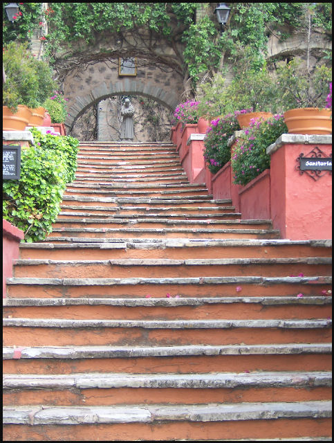
My first thought when I saw this image was that it has great potential. The exposure is nice, and the perspective is good. I'd like to see the composition cropped a bit tighter, so that the black and white signs on the left and right are the stairs are cut out. By cutting out the archway on the right and the lights at the top, you'd create much stronger lines up to the statue.
Colours are nice in the image, but I'd recommend either increasing their saturation or eliminating colours almost to a black and white.
Most importantly, I think a strong boost in contrast would serve this image very well. The editing ruleset prevents you from selectively dodging and burning or vignetting the edges, but I think a simple curves adjustment layer would have boosted this image to a higher score.
Taking these points into consideration, along with some of the recommendations made in previous comments, I think you have a great image here that could be fixed up and printed. Good job.
I'm thinking you want my eyes to be drawn to the image at the top of the stairs. Unfortunately due to the flatness of the image up there, it doesn't automatically happen. The stairs in the higher up group seem to have the greater focus which doesn't sit well with the viewer.
I really like the lines formed by the stairs, this would make a good, from the ground up shot, I think, but it works for this one too. I only wish that I could make out more details of the guy at the top of the stairs, but I guess that is hard to see with a low res photo. Nicely done.