| Author | Thread |
|
|
11/02/2007 02:11:53 AM |
Hi from the Critique Club,
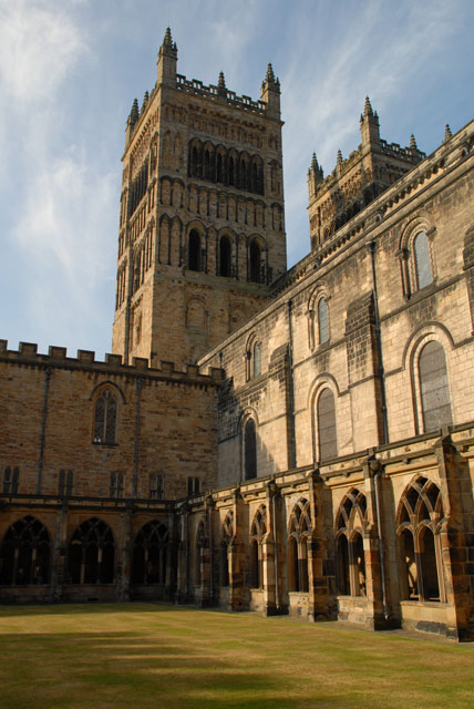
You've captured a beautiful building from a very interesting perspective. I like the composition, although it might have been better if the shadows and the top portion of the other tower weren't in the image. The image might have fared better with an increase in contrast, especially in the sky. For the future, a polarizer does a great job of deepening the blues in skies while maintaining very white clouds.
Alternatively, you could have taken a shot from almost right under the tower, looking up at it and capturing some of the texture of the building.
This is a good image, and a good first submission to DPC. Congratulations, and keep submitting!
Regards,
Geoff |
|
 Photographer found comment helpful. Photographer found comment helpful. |
Comments Made During the Challenge  |
|
|
10/30/2007 09:56:06 AM |
| I think this could use some contrast to bring out the textures and details. Also I wouldn't mind seeing this converted to b&w |
|
| Photographer found comment helpful. |
|
|
10/28/2007 05:10:42 AM |
| I believe this picture would seem better in b/w and colours seem too orange.. |
|
| Photographer found comment helpful. |
|
|
10/26/2007 09:26:08 PM |
|
| Photographer found comment helpful. |
Home -
Challenges -
Community -
League -
Photos -
Cameras -
Lenses -
Learn -
Help -
Terms of Use -
Privacy -
Top ^
DPChallenge, and website content and design, Copyright © 2001-2025 Challenging Technologies, LLC.
All digital photo copyrights belong to the photographers and may not be used without permission.
Current Server Time: 03/12/2025 01:38:38 PM EDT.