| Author | Thread |
Comments Made During the Challenge  |
|
|
11/06/2007 07:35:16 PM |
| The image appears somewhat washed out. |
|
|
|
11/06/2007 05:29:33 PM |
| No true blacks. Why so grey? |
|
|
|
11/05/2007 08:36:27 PM |
| bad background for contrast to show off your subject. every thing looks dusty |
|
|
|
11/02/2007 01:48:07 PM |
| appears washed out/ lens needs cleaning :) |
|
|
|
11/02/2007 12:21:15 PM |
| The lack of contrast with your background hurts. |
|
|
|
11/01/2007 10:26:43 PM |
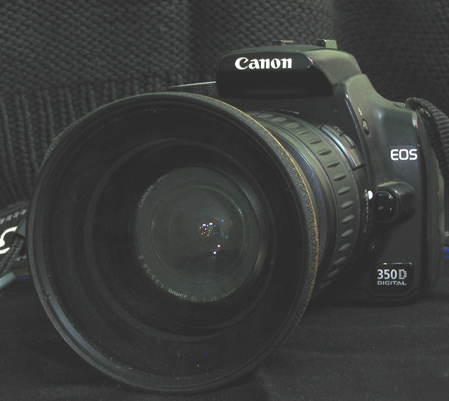
| is that you colorcarnival that i can see in the lens? hehe |
|
|
|
11/01/2007 12:08:17 PM |
|
|
|
10/31/2007 10:11:50 PM |
|
|
|
10/31/2007 10:07:55 PM |
|
|
|
10/31/2007 05:21:40 PM |
| Neat! This image could definitely use some more contrast, though. Or perhaps an adjustment in levels would work better - the black shades in this image are a little too washed out. They're not really black. Also, I might suggest taking the shot a little further away. The camera seems to fill the whole frame, and therefore the composition isn't very strong. Good try though, your shot has nice focus and lighting. |
|
|
|
10/31/2007 09:42:59 AM |
| Congrats on the new toy. The tones on this seem a bit too light; I would also suggest cropping tighter on the left to get rid of the strap and maybe use a background without two competing patterns. |
|
|
|
10/31/2007 09:13:16 AM |
| Check levels - needs more contrast. |
|
|
|
10/31/2007 07:18:27 AM |
|
Home -
Challenges -
Community -
League -
Photos -
Cameras -
Lenses -
Learn -
Help -
Terms of Use -
Privacy -
Top ^
DPChallenge, and website content and design, Copyright © 2001-2025 Challenging Technologies, LLC.
All digital photo copyrights belong to the photographers and may not be used without permission.
Current Server Time: 03/11/2025 02:14:20 PM EDT.