| Author | Thread |
Comments Made During the Challenge  |
|
|
04/07/2002 11:42:00 AM |
|
|
|
04/07/2002 08:31:00 AM |
|
|
|
04/06/2002 10:48:00 PM |
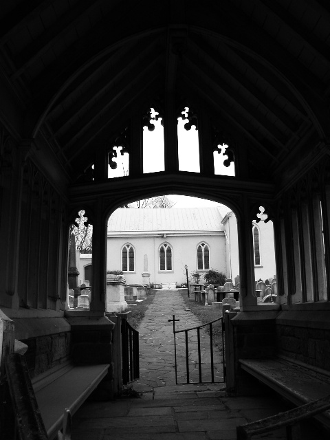
| love your use of the frame. and the tombstones outside - wow. kinda says that death is a liberation from this dark world. |
|
|
|
04/05/2002 03:11:00 PM |
|
|
|
04/05/2002 02:01:00 AM |
| Good composition, depth of field. |
|
|
|
04/03/2002 03:11:00 PM |
| Excellent example of architechture... I'm wondering what this shot would have looked like if the camera were a little lower to the ground and not as much black space at the top of the image.... |
|
|
|
04/03/2002 12:46:00 PM |
| Would love to see more detail in the shadows. |
|
|
|
04/02/2002 08:55:00 PM |
| i've always been a sucker for b & w. this looks like a neat old church. |
|
|
|
04/02/2002 01:42:00 PM |
| evocative shot. slightly tilted/ off horizontal though, which is distracting |
|
|
|
04/02/2002 08:14:00 AM |
| Very nice shot. Dare I should say that with the swining open door, it's got an element of mystery. Very well done. |
|
|
|
04/01/2002 09:38:00 PM |
| You practically framed the picture. What did you want me to see? |
|
|
|
04/01/2002 05:44:00 PM |
| I like the photo - great contrast. I think it would be better if it was cropped so that the door/opening took up more and there was less black space at the top. But still, a very good photo. |
|
|
|
04/01/2002 03:56:00 PM |
| lovely contrasts; tilt is not enough to be dramatic; I would've closed the left side of the gate; really nice depth |
|
|
|
04/01/2002 02:29:00 PM |
I like this shot, but I would have liked to have seen more light here in the front, to see what this entryway looks like. Also I would have closed both sides of the gate.
The B&W gives it a great look. |
|
|
|
04/01/2002 12:06:00 PM |
| real moody shot - monochrome works well here |
|
|
|
04/01/2002 11:56:00 AM |
|
|
|
04/01/2002 08:02:00 AM |
| you captured a ot of different shapes...good job |
|
|
|
04/01/2002 07:14:00 AM |
| So beautiful. I love a pictures that speaks to me. This one tells such a story. Great capture:) |
|
|
|
04/01/2002 01:02:00 AM |
| I love how the light wriggles up into the blackness, but it's at a funny angle. Did you try moving a bit closer to squeeze that stuff in the bottom left off the frame? |
|
|
|
04/01/2002 12:55:00 AM |
| A good choice to go b&w. Would have been better had you corrected the tilt. |
|
|
|
04/01/2002 12:31:00 AM |
| i wish the other gate was closed too..and straightened out but nice nonetheless.. |
|
Home -
Challenges -
Community -
League -
Photos -
Cameras -
Lenses -
Learn -
Help -
Terms of Use -
Privacy -
Top ^
DPChallenge, and website content and design, Copyright © 2001-2025 Challenging Technologies, LLC.
All digital photo copyrights belong to the photographers and may not be used without permission.
Current Server Time: 12/14/2025 07:19:28 PM EST.