| Author | Thread |
|
|
11/07/2007 01:28:30 PM |
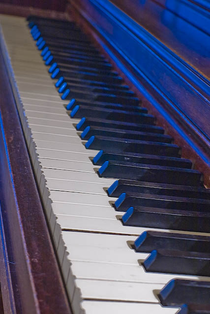
First let me say that if you like the photo then that's what really matters in the end. I do agree with the some of the others that the angle used on this is a bit distracting and off kilter. The keys slanting to the right almost make the piano appear leaning or about to flip backwards. I also believe the the blue tone does no justice for the piano and that a warmer, more amber or yellowish tone, would have flattered this shot a bit more. Another thing that sticks out is the focus, it seems to be a shollow DOF and the focus point is in a strange spot giving the entire image a feel of being soft and oof. Hope this is what your looking for and remember to have fun and learn something everytime you shoot!
Message edited by author 2007-11-07 13:30:08. |
|
 Photographer found comment helpful. Photographer found comment helpful. |
|
|
11/07/2007 11:37:48 AM |
I like the idea of shooting an old piano for this challenge.
Technically speaking, the shot is pretty good. There is a good range of lights and darks, and there is a nice focus on the piano keys.
Compositionally, this photo could use some work. The angle you have chosen has lots of diagonal lines that run from the top of the photo to the bottom. The viewers eyes follow this path, and basically run off the page. The repeated pattern of the piano keys also leads our eyes off the page, as there isn't much to break up the repetition.
I find the blue light to be very distracting. Instead of showcasing the piano, the blue light becomes the main subject because it is so bright and intense. I also find that the blue light contradicts the subject of something old. The strong blue light reminds me of a neon sign in a bar, and I wouldn't consider a neon sign as something old.
The image also seems to be oversharpened, as there is a halo around many of the keys.
I hope this is helpful. If you have any questions, feel free to PM me.
|
|
| Photographer found comment helpful. |
|
|
11/07/2007 11:13:43 AM |
Piano shots are challenging to make interesting. You need a unique angle and lighting to really pull it off IMO. This photo is kind of static and "ho-hummish". Nothing to grab the viewer...next photo please.
The first thing that screams "fix me" is the blue cast. From your notes it appears you made some adjustment to the blue hue? Did you add or increase the blue? Personally I would have adjusted using color balance and warmed it up to remove the daylight blues (next to a window I take it).
Next is the haloing. Appears to be oversharpened.
Last couple of things is the overall lighting and POV. The lighting seems harsh and glaring. With the POV you've chosen it's impossible to get all of the keys in focus, so where do you focus? Seems that your focal point is shallow and the viewer has to hunt a little to find the spot to zero in on.
If this was the subject I was going to shoot, I would have gotten down lower and given more emphasis to the worn key edges. A very shallow DOF coming in tight on a few keys. JMO of course. |
|
| Photographer found comment helpful. |
Comments Made During the Challenge  |
|
|
10/31/2007 08:44:02 PM |
| cant say i like the blue light on this and the cropping could be better imo |
|
| Photographer found comment helpful. |
|
|
10/31/2007 07:37:36 PM |
| Great idea and angle, but I'm not understanding the blue lighting. |
|
| Photographer found comment helpful. |
Home -
Challenges -
Community -
League -
Photos -
Cameras -
Lenses -
Learn -
Help -
Terms of Use -
Privacy -
Top ^
DPChallenge, and website content and design, Copyright © 2001-2025 Challenging Technologies, LLC.
All digital photo copyrights belong to the photographers and may not be used without permission.
Current Server Time: 03/15/2025 01:58:15 AM EDT.