| Author | Thread |
|
|
09/30/2002 12:05:00 AM |
|
Comments Made During the Challenge  |
|
|
09/29/2002 05:50:00 PM |
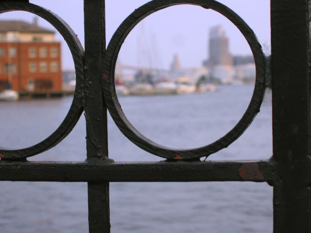
| Why is the target out of focus, cmon I trust youre a better photographer than that. |
|
|
|
09/28/2002 03:08:00 AM |
| The title really adds to the photo... it's like the photo sets the mood, and the title makes you say "oh yeah, that's definately the feeling I get from this shot" nice shot all around. 8 |
|
|
|
09/27/2002 10:52:00 PM |
| you draw my eyes thru the circles, yet the scene is not focused. Why? |
|
|
|
09/27/2002 12:08:00 PM |
| Just feels like the focus is wrong. I would have tried to use the steel to frame the boats instead of focusing on the steel. 6 nards656 |
|
|
|
09/26/2002 08:35:00 AM |
| fells point is a wonderful place. nice way to capture it. |
|
|
|
09/26/2002 02:16:00 AM |
|
|
|
09/26/2002 01:34:00 AM |
| focus just seems wrong. doesn't seem to have a "point" or center of interest. |
|
|
|
09/25/2002 11:09:00 PM |
| I think I'd have prefered the focus out in the background and the railings blurred, but it is an interesting composition and gives the feel of docklands everywhere. |
|
|
|
09/25/2002 02:45:00 PM |
|
|
|
09/25/2002 12:02:00 PM |
| nice placement of the buildings, real strong. |
|
|
|
09/25/2002 01:29:00 AM |
| I spent so much time in Baltimore growing up and I get very nostalgic about it. Nice DOF choice; I like this image alot, but knowing Fell's Point, I wonder if you could've chosen something a little more evocative. Nevertheless, I rate it a 7 sjgleah |
|
|
|
09/24/2002 09:52:00 PM |
|
|
|
09/24/2002 09:13:00 AM |
Composition: Subject Placement, Cropping, Background6,
Technical: Focus, Exposure, Lighting, Processing7,
Appeal: Is it Interesting, Motivating, Etc.? 5,
Total Averaged Rating6. Autool
|
|
|
|
09/23/2002 06:52:00 PM |
| Cool perspective. I feel as I am looking thru glasses that are the wrong prescription! |
|
|
|
09/23/2002 06:28:00 PM |
| Nice job, I like the colors and composition. I like the title as well, it fits. DPz |
|
|
|
09/23/2002 03:20:00 PM |
| this one is nice...arty...I would buy this as a postcard... |
|
|
|
09/23/2002 03:00:00 PM |
| I think if you could have focused on the water and buildings and "arranged" the iron(?) work different in the frame, so that the circles weren't cut off on the top, it would be more effective. The difficult thing would be to avoid "blurriness" on the structure in the front. karmat |
|
|
|
09/23/2002 11:35:00 AM |
| I really want to see what's out of focus. Perhaps you could have increased the depth of field and given us more to look at. |
|
|
|
09/23/2002 11:01:00 AM |
| WOW. This is just wonderful work to my eye! Score 8 Justine |
|
|
|
09/23/2002 01:42:00 AM |
| I might have liked to have seen this the opposite way -- with the background in focus and the foreground blurred. Still an interesting shot. |
|
|
|
09/23/2002 01:16:00 AM |
| Interesting concept. I'm trying to remember where Fels Point is, and I'm thinking Boston. If I'm wrong, my apologies. |
|
Home -
Challenges -
Community -
League -
Photos -
Cameras -
Lenses -
Learn -
Help -
Terms of Use -
Privacy -
Top ^
DPChallenge, and website content and design, Copyright © 2001-2025 Challenging Technologies, LLC.
All digital photo copyrights belong to the photographers and may not be used without permission.
Current Server Time: 03/16/2025 02:38:51 PM EDT.