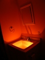
Just snapped this tonight, and it's my first entry ever! Figured I would kind of ease in to it with this little snap shot and hope I don't get DQed for any reason. Did a few touch ups in my raw conversion, exposure, WB, hues and what not - then cropped it up and sized it for the web. Nothing special I know, but I plan to use this to learn from :D. You can see my light source in the bottom right corner, there were some lights pretty far off at the road that came in to play some, so I'm not sure if this meets the rules and all for sure - but I hope!
Statistics
Place: 168 out of 199 Avg (all users): 4.6318 Avg (commenters): 3.3333 Avg (participants): 4.6667 Avg (non-participants): 4.6209 Views since voting: 784 Views during voting: 267 Votes: 201 Comments: 6 Favorites: 0
It's not a bad shot, but from the DPC perspective, it suffers from a couple of things...
* It's too complicated. You only have 640 pixels to work with, and voters only look at an image for 2 seconds before voting. Anything complicated will get whacked in voting. You have to create an image that says what you're trying to say in really simple terms, with nothing else to take the viewer's attention. The kinds of things that work as large, detailed prints often don't work at DPC.
* Subject. It looks like your subject is a "no smoking" sign, because the sign is the best lit part of the shot. A more interesting subject will get more interesting votes.
* Lighting, clarity, sharpness, etc. General technicals are okay, but nothing special.
* Meeting the challenge. I may be wrong, but it *appears* that there's more than one light source lighting things in the shot. It doesn't really matter if you're actually meeting the challenge. It's all about appearances. If the voters think you're not meeting the challenge, you'll get beat up, especially if there's any other problems with the photo.
I think a slightly longer exposure would've helped this score better. I think it is just missing some of the richer tones that could be had by adjusting that.
For shots like this, thee are a few things that voters really look for:
1. Clarity
2. Sharpness
3. Simplicity (not cluttered and easily identifiable subject)
4. Execution
5. Meeting the Challenge (ones that are a stretch always suffer)
Perhaps this one scored the way it did was because the subject isn't entirely clear. As another commenter posted, you may have lost a bit of quality when going down to 640 pxs. I think the two main things though because it seems somewhat cluttered (has killed me in the past =) ), not sharp, and too dark.
It takes a while to figure out what the voters are looking for, but I think you have what it takes. Just look around at previous challenges to get ideas of how the voting tallies up on different sorts of shots.