| Author | Thread |
Comments Made During the Challenge  |
|
|
02/24/2004 11:43:05 PM |
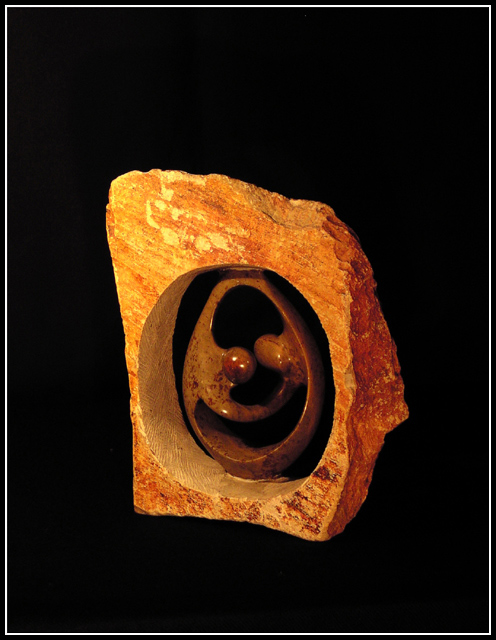
| I think you have done an excellent job on this challenge. I think I would have like the Hot Spots removed on the polished piece yet it does help define the texture. |
|
|
|
02/24/2004 12:30:07 AM |
| Great piece of art. Nice texture contrast and great choice for background and light. |
|
 Photographer found comment helpful. Photographer found comment helpful. |
|
|
02/23/2004 11:48:57 PM |
| Very nice colors and composition |
|
| Photographer found comment helpful. |
|
|
02/23/2004 10:16:54 AM |
| I think when objects are placed on black like this they feel almost as if they are floating on air. needs something to give it some depth and substance. |
|
| Photographer found comment helpful. |
|
|
02/22/2004 08:51:55 AM |
| Nice texture. But, I would have like to have seen it cropped with less black. |
|
| Photographer found comment helpful. |
|
|
02/22/2004 06:10:59 AM |
|
| Photographer found comment helpful. |
|
|
02/20/2004 11:24:25 PM |
| A very lovely piece of art. My family has something similar but without the wood around it. Great lighting too. |
|
|
|
02/20/2004 02:30:07 PM |
| Nice image & nice warm coloursm Somehow seems a tad soft, but still one of my favourites. May be marked down as the image is a little centered, but I think it works OK. |
|
|
|
02/20/2004 08:19:15 AM |
| The 'floating in space' thing doesn't work for such an obviously weighty and real thing, in my mind. It looks too muc like it's simply an illustration, rather than a artistic work of photography. You light is a bot too overall even to be really effective on those texture also, for me - perhpas from a more extreme angle woth the key-light, or perhaps not filling quite so much might have let more come through. |
|
| Photographer found comment helpful. |
|
|
02/19/2004 08:46:23 PM |
| Solid image - pleasing lighting. To make it better, I'd like to be closer to the two different textures. |
|
| Photographer found comment helpful. |
|
|
02/19/2004 08:26:34 PM |
| It looks very 2D. I think you need a shadow in there to add depth. |
|
|
|
02/19/2004 12:45:16 PM |
| This is photographed well enough....lighting, simple background, focus is okay. It just doesn't hold my interest. |
|
| Photographer found comment helpful. |
|
|
02/19/2004 11:48:44 AM |
| This needs to be cropped in much tighter, IMHO. |
|
| Photographer found comment helpful. |
|
|
02/19/2004 01:07:55 AM |
| Beautiful textures in the stone and in the artwork it surrounds. Nicely photographed and presented. This piece of artwork fits the texture challenge, but could use (in my opinion, of course) something original from the photographer to set it off. |
|
| Photographer found comment helpful. |
|
|
02/18/2004 12:48:06 PM |
| Getting closer to the subject, so taht the texture was even more prominent would have made this shot very nice, I think. It is an interesting subject |
|
| Photographer found comment helpful. |
|
|
02/18/2004 12:00:57 PM |
| A contrast of textures and colors .... good use of space and placement. Border works well too. One of my top picks - good job. |
|
| Photographer found comment helpful. |
Home -
Challenges -
Community -
League -
Photos -
Cameras -
Lenses -
Learn -
Help -
Terms of Use -
Privacy -
Top ^
DPChallenge, and website content and design, Copyright © 2001-2025 Challenging Technologies, LLC.
All digital photo copyrights belong to the photographers and may not be used without permission.
Current Server Time: 03/12/2025 01:45:47 PM EDT.