| Author | Thread |
|
|
12/11/2007 02:36:50 PM |
I wanted to stay away from commenting on your challenge images since a) most of them have lots of comments already, and b) they're often inspired by the challenge not your insides.
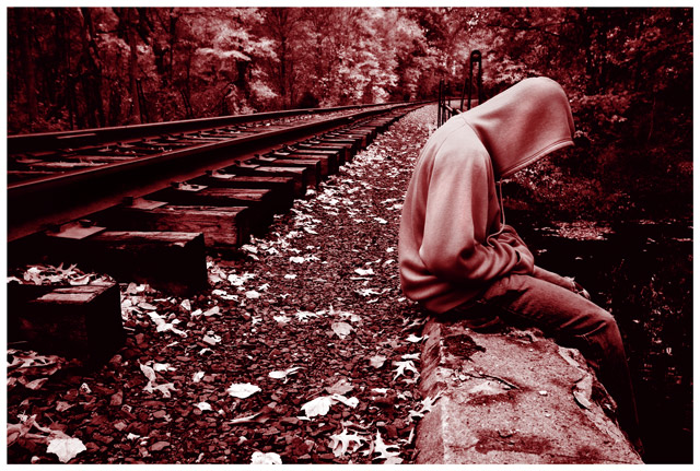
this one caught my eye though. it's good as is, but could be great. I get that it was a duotone challenge, but there's a little too much red in it for me. the colour dominates the photo a bit; lowering the saturation by about 20% would be spectacular. the other thing is the crop. i think this is another case where it needs to be either a bit looser or tighter, depending on the feeling you're going for. as it stands its a bit too far away to be personal, and a bit too close to give that lonely feeling you seemed to be aiming for.
like i said, it's already a good image - has potential to be great. I see a few people below didn't agree with red; blue may have been the more obvious choice, but then again...who says you need to be obvious? ;) |
|
 Photographer found comment helpful. Photographer found comment helpful. |
Comments Made During the Challenge  |
|
|
11/18/2007 08:34:49 PM |
| great composition and feel. I like the low pov. Also has some story here. bumping 7 |
|
| Photographer found comment helpful. |
|
|
11/18/2007 04:32:48 PM |
| Red was a wrong choice in color imo. |
|
| Photographer found comment helpful. |
|
|
11/16/2007 02:51:56 PM |
| Great image. The processing really fits with the downtrodden, depressed feel of this. |
|
| Photographer found comment helpful. |
|
|
11/16/2007 01:26:44 PM |
| Great composition and details. Maybe a touch too red, but nice, nonetheless |
|
| Photographer found comment helpful. |
|
|
11/16/2007 11:10:46 AM |
| I like the tone you chose. It seperates you from the rest. Nice composition and idea. |
|
| Photographer found comment helpful. |
|
|
11/14/2007 05:12:17 PM |
| I'm not sure why you chose magenta for this very nice and meaningful composition. I find the color distracting rather than enhancing. 7 |
|
| Photographer found comment helpful. |
|
|
11/13/2007 06:27:37 PM |
| Like the red and that you can't see a face. |
|
| Photographer found comment helpful. |
|
|
11/13/2007 11:56:01 AM |
Great shot and nice color. I love this. 8
bumping to 9. |
|
| Photographer found comment helpful. |
|
|
11/12/2007 12:44:56 PM |
| Soulful image, well composed. Did you try it in blue? The melancholy mood would have been heightened, IMO. |
|
| Photographer found comment helpful. |
|
|
11/12/2007 11:34:21 AM |
| Nice shot, odd choice of colour for the conversion. |
|
|
|
11/12/2007 10:13:35 AM |
| Love the line and the tones but I'm not too sure about the red. I think a blue/gray or maybe a warm BW would suit it better. Bravo on the comp and focus though. Great leading line. |
|
| Photographer found comment helpful. |
|
|
11/12/2007 02:02:39 AM |
| I like the mood of this...it has a particular atmosphere in it that makes you feel loneliness or something...well done |
|
| Photographer found comment helpful. |
Home -
Challenges -
Community -
League -
Photos -
Cameras -
Lenses -
Learn -
Help -
Terms of Use -
Privacy -
Top ^
DPChallenge, and website content and design, Copyright © 2001-2025 Challenging Technologies, LLC.
All digital photo copyrights belong to the photographers and may not be used without permission.
Current Server Time: 03/10/2025 09:55:24 PM EDT.