| Author | Thread |
|
|
02/26/2004 06:15:09 PM |
just stop... please... stop
Message edited by author 2004-02-26 18:15:32. |
|
Comments Made During the Challenge  |
|
|
02/24/2004 04:25:57 PM |
| Looks an interestign subject but I'm afraid I don't have a clue what t is I'm meant to be feeling. Perhaps I should know but I don't and this detracts from the appeal of the photo and its response to the challenge. |
|
|
|
02/22/2004 11:09:20 AM |
| very clever title and a great point of view makes this one of my favorites in this challenge. |
|
|
|
02/22/2004 04:56:18 AM |
|
|
|
02/21/2004 08:13:52 AM |
|
|
|
02/21/2004 12:56:15 AM |
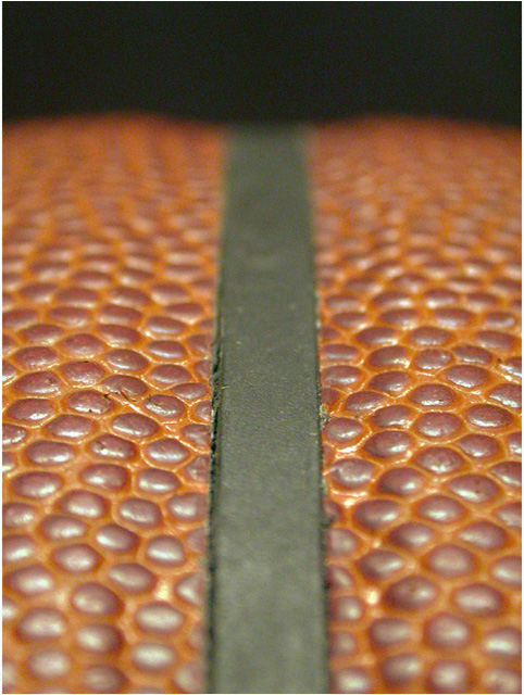
| Shallow DOF....it works.. texture of B-Ball works here... and I like the "road"...I also like the NCAA....good job |
|
|
|
02/20/2004 10:56:54 PM |
| Oh, I get it, you put a ribbon on your pet snake! Very creative. Just kidding. This is a very creative perspective on the ball, in my opinion it's just not that visually attractive. |
|
|
|
02/20/2004 09:16:04 PM |
| Nice close up, but a noisy background. |
|
|
|
02/20/2004 10:00:43 AM |
| I like it but there should be some cropped off the bottom or increase DOF a bit so that it is in focus at the bottom of the frame too. |
|
|
|
02/20/2004 08:34:59 AM |
| Great idea, great shot. One thing though, I would have cropped so that the near part of the image was in focus and then faded. The front blur doesn't help this, which is too bad, because this is a great idea. Oops, I said that already. Must have meant it..... |
|
|
|
02/20/2004 06:36:11 AM |
| How I wonder what it is? No great sense of texture, what there is is from those reflections rather than a movment of light, which makes it less pleasing to look at. |
|
|
|
02/19/2004 11:58:42 PM |
|
|
|
02/19/2004 03:58:18 PM |
good idea well exucuted
nice shot |
|
|
|
02/19/2004 03:36:55 PM |
|
|
|
02/19/2004 12:12:25 PM |
| The texture is here. The subject and composition don't hold my interest. |
|
|
|
02/19/2004 04:41:39 AM |
[World Record Attempt]
+ I have no idea what it is. Because of that I keep on looking at it trying to figure it out; your image certainly has appeal :). There are lots of textures to be seen here. Interesting colour combination.
- Focus point should be a little more to the front. The black background is a little boring but at the same time contrast nicely with the orange/brownish foreground. |
|
|
|
02/19/2004 12:07:28 AM |
|
|
|
02/18/2004 06:55:06 PM |
|
|
|
02/18/2004 12:54:18 PM |
| Very unique idea, I think. Good work. |
|
|
|
02/18/2004 04:48:50 AM |
| quite low colour which i like but not on this occasion. There is a lot of noise going on in the lower black at the top. |
|
|
|
02/18/2004 01:37:08 AM |
| too much not in focus. DOF! |
|
|
|
02/18/2004 01:20:13 AM |
| I would be better able to "feel" the texture of this with more depth of field, otherwise nice shot |
|
Home -
Challenges -
Community -
League -
Photos -
Cameras -
Lenses -
Learn -
Help -
Terms of Use -
Privacy -
Top ^
DPChallenge, and website content and design, Copyright © 2001-2025 Challenging Technologies, LLC.
All digital photo copyrights belong to the photographers and may not be used without permission.
Current Server Time: 03/12/2025 05:13:51 PM EDT.