| Author | Thread |
Comments Made During the Challenge  |
|
|
11/16/2007 02:53:25 PM |
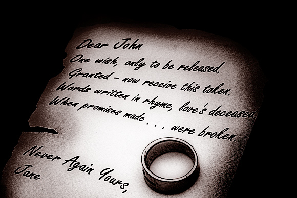
| very nice processing on this rather depressing message. The duotone effect really works well here. |
|
 Photographer found comment helpful. Photographer found comment helpful. |
|
|
11/16/2007 01:56:20 PM |
| Your editing works very well on this type of shot, the tone works nicely as well. I think if the letter filled more of the frame however, it would have been a stronger image, IMO. Nice work. |
|
| Photographer found comment helpful. |
|
|
11/15/2007 03:58:34 PM |
| That would suck. I like the clarity in the shot, good coloring |
|
| Photographer found comment helpful. |
|
|
11/14/2007 12:26:49 PM |
|
| Photographer found comment helpful. |
|
|
11/14/2007 09:47:15 AM |
| Pretty capture. Love the tones. |
|
| Photographer found comment helpful. |
|
|
11/13/2007 01:47:14 AM |
|
|
|
11/12/2007 01:52:16 PM |
| Powerful. It may not score too well, but I do like this very much. |
|
| Photographer found comment helpful. |
|
|
11/12/2007 09:17:41 AM |
| Nice job on the processing. I like the way the eye is drawn into it. |
|
| Photographer found comment helpful. |
Home -
Challenges -
Community -
League -
Photos -
Cameras -
Lenses -
Learn -
Help -
Terms of Use -
Privacy -
Top ^
DPChallenge, and website content and design, Copyright © 2001-2025 Challenging Technologies, LLC.
All digital photo copyrights belong to the photographers and may not be used without permission.
Current Server Time: 03/12/2025 11:57:52 PM EDT.