| Author | Thread |
Comments Made During the Challenge  |
|
|
11/27/2007 10:54:29 PM |
| Unfortunately this photo is not clever enough to warrant a high score. The text could be a little darker to really stand out....not sure black and white helped this shot unfortunately. |
|
 Photographer found comment helpful. Photographer found comment helpful. |
|
|
11/26/2007 04:30:55 PM |
| This picture is a little bit too simple. |
|
| Photographer found comment helpful. |
|
|
11/26/2007 03:45:41 PM |
|
| Photographer found comment helpful. |
|
|
11/25/2007 02:21:45 AM |
| Seems like nothing special.. |
|
| Photographer found comment helpful. |
|
|
11/23/2007 12:28:46 AM |
| Nice, but some bolder contras would have had some impact for me. |
|
| Photographer found comment helpful. |
|
|
11/22/2007 11:58:11 AM |
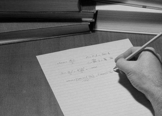
| A shot of math is too scary to win. |
|
| Photographer found comment helpful. |
|
|
11/22/2007 11:13:32 AM |
| Looks like an average phot made worse by setting saturation to 0 |
|
| Photographer found comment helpful. |
|
|
11/21/2007 05:58:11 PM |
| Could use some more contrast and a more creative angle to focus on writing. I like the play on words. |
|
| Photographer found comment helpful. |
|
|
11/21/2007 11:27:40 AM |
| can't feel the image really... a little more distinct tone would have done the job... |
|
| Photographer found comment helpful. |
|
|
11/21/2007 07:31:24 AM |
| I like the composition and the idea enough, but seems a bit flat - maybe i needs a bit more contrast. |
|
| Photographer found comment helpful. |
|
|
11/21/2007 07:16:52 AM |
| nice formulas! this could really benefit from some adjustments in levels to bring out the whites and create some strong blacks. |
|
| Photographer found comment helpful. |
Home -
Challenges -
Community -
League -
Photos -
Cameras -
Lenses -
Learn -
Help -
Terms of Use -
Privacy -
Top ^
DPChallenge, and website content and design, Copyright © 2001-2025 Challenging Technologies, LLC.
All digital photo copyrights belong to the photographers and may not be used without permission.
Current Server Time: 03/16/2025 07:42:21 PM EDT.