| Author | Thread |
Comments Made During the Challenge  |
|
|
12/06/2007 01:06:22 PM |
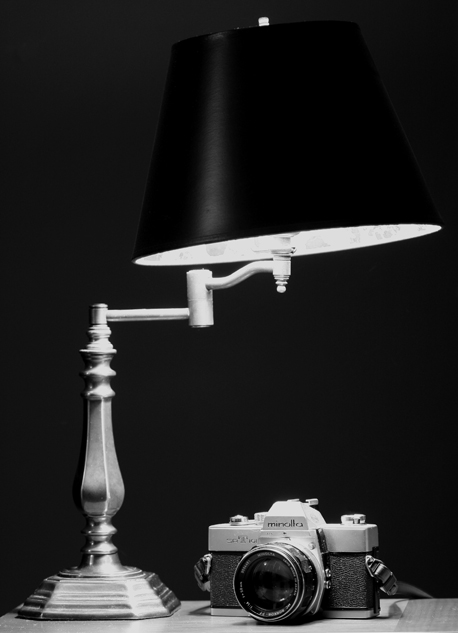
| Would have liked to see more separation between the edge of the lampshade & the background, they blend together too much for my tastes. |
|
 Photographer found comment helpful. Photographer found comment helpful. |
|
|
12/02/2007 11:44:05 PM |
good to see how someone sets up there lights. :)
black and white suits this well |
|
| Photographer found comment helpful. |
|
|
12/02/2007 06:05:42 AM |
| The lamp shade is a bit too dark creating a very large area of wasted space imo - maybe if it was a dark shade of grey it wouldnt impose too much on the subject but would add something more to the image so that the space up there wasnt so bleak. |
|
| Photographer found comment helpful. |
|
|
12/01/2007 10:47:52 PM |
| Nice light(ing)! LOL!!! What is that other thing.......looks vaguely like a camera. Nicely done. 7 |
|
| Photographer found comment helpful. |
Home -
Challenges -
Community -
League -
Photos -
Cameras -
Lenses -
Learn -
Help -
Terms of Use -
Privacy -
Top ^
DPChallenge, and website content and design, Copyright © 2001-2025 Challenging Technologies, LLC.
All digital photo copyrights belong to the photographers and may not be used without permission.
Current Server Time: 03/10/2025 12:18:44 PM EDT.