| Author | Thread |
|
|
12/11/2007 06:57:49 PM |
Greetings from the Critique Club :)
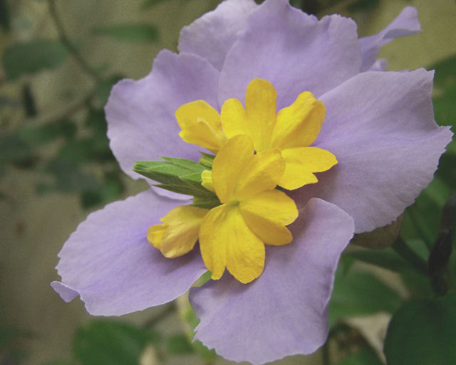
It looks like your commenters put it very well. This image screams for contrast and color. There is much potential in this photo but it needs some post processing. Contrast and saturation would do wonders. Possibly some sharpening - it is hard to see whether it is in focus or not.
You seem to have done a good job with a shallow DOF as the background is nicely blurred. It would be nice to see this image after some procesing.
Please feel free to contact me via the PM system.
Ken
alexzen
|
|
Comments Made During the Challenge  |
|
|
12/04/2007 10:51:26 PM |
| The contrast is a bit flat. |
|
 Photographer found comment helpful. Photographer found comment helpful. |
|
|
12/04/2007 11:16:56 AM |
| Seems a bit faded, but that may be because the ones I've just seen were SO saturated. |
|
| Photographer found comment helpful. |
|
|
12/02/2007 06:59:43 PM |
| Very washed-out feeling to it. Try darkening the background than increasing the contrast levels in editing of those two flowers. |
|
| Photographer found comment helpful. |
|
|
12/02/2007 06:21:42 PM |
| Unfortunately the colours look washed out. |
|
| Photographer found comment helpful. |
|
|
12/01/2007 05:54:52 PM |
| This could be so beautiful with a little postprocessing. The colors looks so flat here. |
|
| Photographer found comment helpful. |
|
|
11/29/2007 06:47:03 PM |
| Needs a little more contrastin my opinion. |
|
| Photographer found comment helpful. |
|
|
11/29/2007 05:30:18 PM |
| i like the unique flower. perhaps a tad bit exposure and contrast would improve the image. |
|
| Photographer found comment helpful. |
|
|
11/29/2007 05:45:58 AM |
| overall too pal, focus is very soft |
|
| Photographer found comment helpful. |
|
|
11/28/2007 07:41:30 PM |
| I wish the purple was more vibrant but this is a good shot. |
|
| Photographer found comment helpful. |
|
|
11/28/2007 01:48:08 PM |
| This image would have benefited from some post processing, such as levels, brightness/contrast, hue/saturation. |
|
| Photographer found comment helpful. |
|
|
11/28/2007 06:19:26 AM |
| seems a little dull? perhaps bumping up the saturation would help? |
|
| Photographer found comment helpful. |
|
|
11/28/2007 12:37:38 AM |
| Colors too muted, insufficient saturation and contrast - 4 |
|
| Photographer found comment helpful. |
Home -
Challenges -
Community -
League -
Photos -
Cameras -
Lenses -
Learn -
Help -
Terms of Use -
Privacy -
Top ^
DPChallenge, and website content and design, Copyright © 2001-2025 Challenging Technologies, LLC.
All digital photo copyrights belong to the photographers and may not be used without permission.
Current Server Time: 03/12/2025 07:41:31 AM EDT.