| Author | Thread |
Comments Made During the Challenge  |
|
|
12/04/2007 09:15:27 PM |
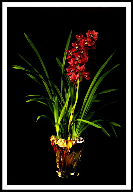
| some things I think may have helped this. I feel the flower is too far away to enjoy the details, I would have gotten closer and pick out some details of red and green instead of showing the whole plant. This would have also helped with making a more interesting composition as this is very centered my eye doesn't really want to move around the photo. I would have gotten rid of the border, IMO it doesn't help too much. Since you shot this on all black I would have tried to play with the lighting some more, maybe putting it on the side to add some more depth, you could even use that gold foil on the bottom of the pot as a reflector and put it on the opposite side of the light to fill in the shadows. Lastly, try to get you file size up to 150 kb, your image used only 81 kb. This means you could have had twice as much smoothness in your finer details. If you use photoshop try using the Save for Web function instead of Save. Here is a little tutorial on DPC that may help you get your images ready for challenges. I hope this helps, I am not trying to be hard on you just make some suggestions. :) |
|
 Photographer found comment helpful. Photographer found comment helpful. |
|
|
12/03/2007 03:11:14 AM |
| The top is seemingly a bit underlit IMO. I do think the composition is wonderful. |
|
| Photographer found comment helpful. |
|
|
11/30/2007 01:40:36 PM |
|
| Photographer found comment helpful. |
|
|
11/29/2007 04:40:35 PM |
| nice simple photo. i'd hang this on a wall. |
|
| Photographer found comment helpful. |
|
|
11/28/2007 07:56:06 PM |
| Nice shot! The foil on the bottom is a little distracting but this is well lit and everything. Good luck! |
|
| Photographer found comment helpful. |
|
|
11/28/2007 12:33:28 PM |
|
| Photographer found comment helpful. |
|
|
11/28/2007 12:07:55 PM |
| frame it overdone in my opinion |
|
| Photographer found comment helpful. |
|
|
11/28/2007 09:56:29 AM |
| Painted with light? Great photo. Not crazy about the tinfoil on the pot, but that's just a preference thing. |
|
| Photographer found comment helpful. |
|
|
11/28/2007 05:49:48 AM |
| nice colors. border is a bit too much imo. |
|
| Photographer found comment helpful. |
Home -
Challenges -
Community -
League -
Photos -
Cameras -
Lenses -
Learn -
Help -
Terms of Use -
Privacy -
Top ^
DPChallenge, and website content and design, Copyright © 2001-2025 Challenging Technologies, LLC.
All digital photo copyrights belong to the photographers and may not be used without permission.
Current Server Time: 04/02/2025 01:42:22 PM EDT.