| Author | Thread |
|
|
12/25/2008 09:44:20 PM |
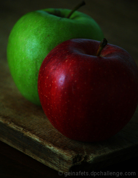
| I like the composition of this. Though already stated as a bit oof, this is a strong still life and think an impressionistic type filter would suit this perfectly. |
|
 Photographer found comment helpful. Photographer found comment helpful. |
|
|
04/19/2008 01:00:57 PM |
| A bit out of focus and too dark |
|
| Photographer found comment helpful. |
Comments Made During the Challenge  |
|
|
12/04/2007 11:13:44 AM |
| A bit dark, but the textures are nice - especially the table. |
|
| Photographer found comment helpful. |
|
|
12/02/2007 08:39:15 PM |
| Would work better if the red apple was more in focus. It seems a bit soft and the entire image is a bit dark. 6 |
|
| Photographer found comment helpful. |
|
|
12/02/2007 06:20:22 PM |
|
| Photographer found comment helpful. |
|
|
12/01/2007 07:45:41 PM |
| I like the composition. Colors are good, but perhaps a little too dim for my own preferences. |
|
| Photographer found comment helpful. |
|
|
12/01/2007 11:33:52 AM |
| nice idea and composition. A tad too dark overall, IMO |
|
| Photographer found comment helpful. |
|
|
11/30/2007 08:55:30 PM |
| This is way too dark. The composition is good, the angle is good, but just too much is lost in the brightness/contrast of this photo. |
|
| Photographer found comment helpful. |
|
|
11/30/2007 12:36:47 PM |
|
| Photographer found comment helpful. |
|
|
11/30/2007 02:27:07 AM |
mmmm...
Could do with being a bit lighter overall |
|
| Photographer found comment helpful. |
|
|
11/29/2007 09:27:36 PM |
| A little dark for my taste. |
|
| Photographer found comment helpful. |
|
|
11/29/2007 09:25:40 PM |
|
| Photographer found comment helpful. |
|
|
11/29/2007 06:53:50 PM |
| The picture may have had more impact if the green apple was in focus as the red one. |
|
| Photographer found comment helpful. |
|
|
11/29/2007 06:44:47 PM |
| i like the darkness of this image |
|
| Photographer found comment helpful. |
|
|
11/29/2007 02:56:22 PM |
| nice composition, but too dark. |
|
| Photographer found comment helpful. |
|
|
11/29/2007 08:48:46 AM |
| Quite dull in tone, could have used levels or curves to make it sparkle more. Also could be quite a bit sharper |
|
| Photographer found comment helpful. |
|
|
11/28/2007 11:04:21 PM |
| Nice, but maybe cropped in too close, left apples too high. Great light and point of view. |
|
| Photographer found comment helpful. |
|
|
11/28/2007 10:13:34 PM |
| I really like the processing on this. Has almost an old-world feel. |
|
| Photographer found comment helpful. |
|
|
11/28/2007 10:00:55 PM |
| I think the lack of light created a sort of blur in the apple(s). I think it would've looked better if the apple was a bit sharper (in more focus) and if it was cropped a bit to even the sides out. But great concept and good choice of positioning. |
|
| Photographer found comment helpful. |
|
|
11/28/2007 07:48:54 PM |
| A bit dark for my liking. |
|
| Photographer found comment helpful. |
|
|
11/28/2007 01:02:49 PM |
| nice concept but too dark. |
|
| Photographer found comment helpful. |
|
|
11/28/2007 07:47:00 AM |
|
| Photographer found comment helpful. |
|
|
11/28/2007 05:47:45 AM |
| A bit more contrast and a bit more sharpness would really help this image pop. |
|
| Photographer found comment helpful. |
|
|
11/28/2007 12:38:13 AM |
| colors too muted & focus too soft - 4 |
|
| Photographer found comment helpful. |
Home -
Challenges -
Community -
League -
Photos -
Cameras -
Lenses -
Learn -
Help -
Terms of Use -
Privacy -
Top ^
DPChallenge, and website content and design, Copyright © 2001-2025 Challenging Technologies, LLC.
All digital photo copyrights belong to the photographers and may not be used without permission.
Current Server Time: 03/12/2025 03:28:38 PM EDT.