| Author | Thread |
Comments Made During the Challenge  |
|
|
12/02/2007 07:50:23 PM |
|
|
|
12/01/2007 08:09:57 AM |
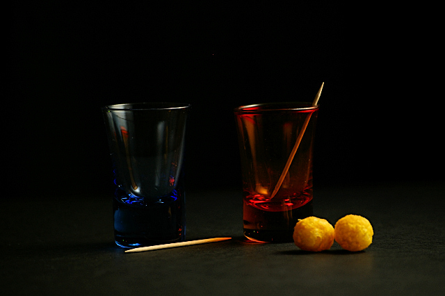
| Very dark, would have lost the ball things as then unbalance the composition. This looks more like red/blue rather than orange/blue on my display which is a shame. The red is much stronger than the blue and so further adds to the unbalance. Red tones are visible as reflections in the blue glass which is nice but hasn't worked the other way around - so more unbalance. Apart from the reflection, the blue and red are in the main, seperated from one another by the background and so you lose the high contrast attained from having complemenary colours against one another |
|
|
|
11/30/2007 12:43:12 PM |
|
|
|
11/28/2007 10:32:14 PM |
|
|
|
11/28/2007 06:40:54 PM |
| Wow...this is really dark. |
|
|
|
11/28/2007 06:33:43 PM |
|
|
|
11/28/2007 11:39:25 AM |
| The cheeseballs made me laugh. |
|
|
|
11/28/2007 08:23:57 AM |
| Almost to dark. Cool idea though. |
|
|
|
11/28/2007 05:54:06 AM |
| it's tilted, too dark and I don't see any green. the other glass looks blue. or is the red one supposed to be orange? |
|
Home -
Challenges -
Community -
League -
Photos -
Cameras -
Lenses -
Learn -
Help -
Terms of Use -
Privacy -
Top ^
DPChallenge, and website content and design, Copyright © 2001-2025 Challenging Technologies, LLC.
All digital photo copyrights belong to the photographers and may not be used without permission.
Current Server Time: 03/18/2025 03:34:51 AM EDT.