| Author | Thread |
|
|
12/11/2007 06:48:42 PM |
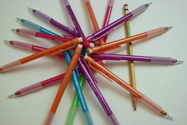
Welcome from the Critique Club :)
It looks like you had a good idea, but it did not score very well. Let me see if I can identify why. Your commenters have hit on several reasons.
Composition
It took me a awhile to find the 'alone' subject. Usually in this type of challenge you want to make sure your main subject stands out clearly. In this case the wooden pencil is quite hidden. Your image is centered. While the alone subject is on the thirds line, my eye goes right to the center where all the other pencils intersect.
Lighting
Very flat. The lighting does not allow the color to jump out and does not allow for any drama.
How could you improve this image?
Make sure you include all subjects in the image. Position the wood pencile such that it jumps out and that your eye goes right to it. Use a brighter light and then use levels to cause your white background to disappear, including shadows. Saturate your colors so they jump out. Make sure your subject is the center of attention, but not centered.
Please feel free to contact me via PM.
Ken
alexzen |
|
Comments Made During the Challenge  |
|
|
12/04/2007 05:57:17 AM |
| I think including the edges of all the pencils would have helped your score. a good concept and way to find a different way to present the challenge theme. |
|
 Photographer found comment helpful. Photographer found comment helpful. |
|
|
12/03/2007 03:00:12 PM |
| I cant see the primal object when i first look. It should be seen when you look at the photograph. Can be on a better side of the photo. |
|
|
|
12/02/2007 04:41:52 AM |
|
|
|
11/29/2007 05:04:04 PM |
| I would have liked to see the circle made from the other pencils completed instead of being cropped on three sides. |
|
| Photographer found comment helpful. |
|
|
11/29/2007 01:54:37 PM |
|
| Photographer found comment helpful. |
|
|
11/29/2007 06:23:34 AM |
| The composition could be better. I could hardly recognize the "alone" subject. And the level is out. |
|
| Photographer found comment helpful. |
|
|
11/28/2007 01:03:02 PM |
|
| Photographer found comment helpful. |
|
|
11/28/2007 10:33:30 AM |
This image lacks the lighting needed to make this stand out. I'm thinking that you might also need to back away from the subject a bit to try and gain more focus on the entire image.
This is a weird layout as some of the pens are in the screen and some are out. You're shadows are too strong too, this is caused by the lack of light on the subject. Good luck with the challenge. |
|
| Photographer found comment helpful. |
Home -
Challenges -
Community -
League -
Photos -
Cameras -
Lenses -
Learn -
Help -
Terms of Use -
Privacy -
Top ^
DPChallenge, and website content and design, Copyright © 2001-2025 Challenging Technologies, LLC.
All digital photo copyrights belong to the photographers and may not be used without permission.
Current Server Time: 03/12/2025 08:31:54 AM EDT.