| Author | Thread |
|
|
12/08/2007 05:35:36 PM |
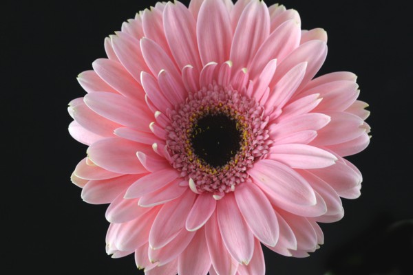
| Well, this was under appreciated IMHO but a bit of post processing could have made a huge difference... A touch of sharpening and a touch more contrast in the flower to really make it pop. |
|
Comments Made During the Challenge  |
|
|
12/06/2007 03:29:37 PM |
beautiful light - Curious about the composition. With the centered composition (which I like) I'd rather see a square crop; with a rectangular crop I'd rather see an offset composition.
But that's just me... |
|
|
|
12/03/2007 08:45:08 PM |
| good DOF, good job eliminating the background. |
|
|
|
12/03/2007 12:06:08 AM |
| You have good color and lighting. Composition is what hurts you the most, IMO. You don't want to cut off the tips of your subject, whether it be someone's hand or a flower's petal. Either make a more aggressive crop or leave some negative space around the subject. In addition, I'd try avoid centering the subject in a landscape oriented shot. A square crop would work better. |
|
|
|
12/02/2007 05:14:14 PM |
| the lighting appears a little flat, I would take a step back because you cut off part of your subject, which breaks the even symmetry. The pink is spot on though looks great :) |
|
|
|
12/02/2007 04:41:40 AM |
| nice sharpness, good color. but the flower is too centered |
|
|
|
12/02/2007 01:17:47 AM |
| With a little processing this would have been stunning. |
|
|
|
12/01/2007 12:31:23 AM |
| Not really enough to capture my interest here, plus the "thing" in the lower right background is distracting. A light from the back would have helped separate the subject from the background too. |
|
Home -
Challenges -
Community -
League -
Photos -
Cameras -
Lenses -
Learn -
Help -
Terms of Use -
Privacy -
Top ^
DPChallenge, and website content and design, Copyright © 2001-2025 Challenging Technologies, LLC.
All digital photo copyrights belong to the photographers and may not be used without permission.
Current Server Time: 03/14/2025 03:56:20 PM EDT.