| Author | Thread |
Comments Made During the Challenge  |
|
|
03/02/2004 11:26:02 PM |
| congrats on the statement (whoever raised them in this order) but it seems almost blasphemous. i don't care for the grain in the sky either. |
|
 Photographer found comment helpful. Photographer found comment helpful. |
|
|
03/02/2004 11:03:00 PM |
| Nice idea and interesting shot. |
|
| Photographer found comment helpful. |
|
|
02/28/2004 03:05:11 PM |
| Good idea, but flip the photo! Conditions may not have permitted, but a better context would have helped a lot: sunset, clouds, trees...? |
|
| Photographer found comment helpful. |
|
|
02/28/2004 02:53:59 AM |
| The color seems a bit dull |
|
| Photographer found comment helpful. |
|
|
02/27/2004 11:58:50 PM |
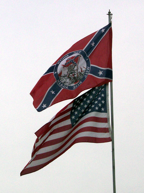
I revisited this shot several times. I certainly understand the conflict. My sense of patriotism was bothered by the fact that the Bars and Stars were flying higher than the Stars and Stripes. That was disturbing because protocol says no country flies higher than another. This is a State! Having said all that. . . you achieved your purpose. My question is, could the point have been made in another way?
The shot could have been a little sharper. Darkening the background might have brought out the colors also. BOL |
|
| Photographer found comment helpful. |
|
|
02/27/2004 05:26:13 PM |
| Not proper at all. Whenever I go places and see such flags I really wonder what people can possible be thinking. Their views are as warped as these flags, twisting in the wind. I wish the whites were a little whiter and the sky not so grainy, but otherwise an excellent image. 7 |
|
| Photographer found comment helpful. |
|
|
02/27/2004 01:00:04 PM |
|
|
|
02/26/2004 09:48:55 PM |
| Good conflict - should have reversed photo to read confederate flat |
|
| Photographer found comment helpful. |
|
|
02/26/2004 03:15:14 PM |
| You did capture conflict. Your flag pole is a bit tilted and I think your colors look a bit flat. Good entry for the challenge, just needs some touch up. |
|
| Photographer found comment helpful. |
|
|
02/26/2004 08:53:45 AM |
| Colors could be a little brighter, but great idea; good reflection of the topic in my opinion. |
|
| Photographer found comment helpful. |
|
|
02/25/2004 10:08:03 PM |
| Should have revesed the picture so you could read the confederate flag...but it is a well depicted conflict...nicely done |
|
| Photographer found comment helpful. |
|
|
02/25/2004 10:07:17 AM |
| Good subject and composition. Strange background |
|
| Photographer found comment helpful. |
|
|
02/25/2004 12:50:54 AM |
| The white sky kind of overpowers everything. |
|
| Photographer found comment helpful. |
|
|
02/25/2004 12:17:28 AM |
|
| Photographer found comment helpful. |
Home -
Challenges -
Community -
League -
Photos -
Cameras -
Lenses -
Learn -
Help -
Terms of Use -
Privacy -
Top ^
DPChallenge, and website content and design, Copyright © 2001-2025 Challenging Technologies, LLC.
All digital photo copyrights belong to the photographers and may not be used without permission.
Current Server Time: 03/13/2025 06:41:49 AM EDT.