| Author | Thread |
|
|
03/09/2004 02:15:35 PM |
Greetings from the Critique Club...
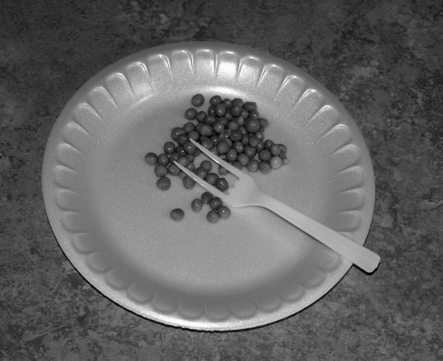
I understand your theme for this challenge, even though I think it is a very weak one. In my personal opinion, this photo is nothing more than an attempt to meet the challenge. There is no creative use of lighting. There is no creative use of color or black and white. There is no creative use in perspective. There is nothing here that draws my attention in a positive way. I think that black and white was a bad choice for this image. The contrast and tonal range is rather flat, wich rarely lends to a good monocrhome or duotone image.
Better luck next time :)
|
|
Comments Made During the Challenge  |
|
|
03/02/2004 01:41:37 AM |
|
|
|
03/02/2004 12:20:16 AM |
| Interesting idea, nice choice for color. |
|
|
|
02/29/2004 03:41:39 PM |
| Poor quality, and weak concept. |
|
|
|
02/29/2004 06:26:18 AM |
| Nice concept but the glare from the flash on the upper side of the plate brings your eye to that instead of the pictures meaning. Its also unbalanced/ uneven and a bad crop. |
|
|
|
02/28/2004 02:44:38 PM |
|
|
|
02/27/2004 04:50:21 PM |
| Similar idea to my own Faux Pas! By the way the light on the plate gives it an optical illusion. ie: is the plate unside down? |
|
|
|
02/27/2004 03:31:21 PM |
| A kind of out-there idea, but more appropriate than some others for the challenge. I like the textures you've captured. The picture is flat and monotone, though; I just don't want to spend much time with it. |
|
|
|
02/26/2004 09:16:22 AM |
| This photo is just plain not appealing to me in any fashion. It's not a technically bad photo, although it could be a bit brighter, and I do see the "conflict"...it's just not esthetically pleasing to my eye. |
|
|
|
02/26/2004 01:31:51 AM |
|
|
|
02/25/2004 10:22:54 PM |
| Soemone doent like their peas Shame on you |
|
|
|
02/25/2004 09:30:13 PM |
| awesome idea good picture maby would've been better in color so the peas stand out |
|
|
|
02/25/2004 06:33:27 PM |
| hmmmm peas, i wouldn't have thought you liked peas, really, crop in closer and work on contrast... and remember that food shelters do serve more than peas |
|
|
|
02/25/2004 05:37:00 PM |
| You must have been cracking up when you took this...I like it! |
|
|
|
02/25/2004 04:38:51 PM |
| where is the contrast? The image is also tensively boring but sure its a conflict but eat with your hands who cares you already have a plastic plate. |
|
|
|
02/25/2004 02:28:45 PM |
| nice pic, but (for me) does not fit the challenge well - it doesn't say 'conflict' without an explanation. Show the pic to strangers, and say nothing. Ask "What is the first thing that comes to mind?" and let me know if anyone gets it. |
|
|
|
02/25/2004 02:07:33 PM |
| Very cute and really a stretch to meet the challenge. I think this shot would have been much better in color, the black and white is okay but the contrast is lacking and the lighting is a bit dark for this shot, to me. The pattern on the table top is also a bit distracting, perhaps something solid? A 6 |
|
|
|
02/25/2004 08:55:57 AM |
| funny idea but i think it it were a sharper contrast it would have been a bit more appealing. too flat i think... |
|
Home -
Challenges -
Community -
League -
Photos -
Cameras -
Lenses -
Learn -
Help -
Terms of Use -
Privacy -
Top ^
DPChallenge, and website content and design, Copyright © 2001-2025 Challenging Technologies, LLC.
All digital photo copyrights belong to the photographers and may not be used without permission.
Current Server Time: 03/12/2025 08:07:37 AM EDT.