| Author | Thread |
Comments Made During the Challenge  |
|
|
03/02/2004 01:43:30 AM |
|
 Photographer found comment helpful. Photographer found comment helpful. |
|
|
02/28/2004 11:57:20 AM |
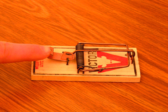
| Interesting shot and coloring. It doesn't convey the message of conflict by itself. |
|
| Photographer found comment helpful. |
|
|
02/27/2004 12:11:57 AM |
| That's potential conflict right there... |
|
| Photographer found comment helpful. |
|
|
02/26/2004 08:39:07 PM |
| arghh carefull those things hurt .... |
|
| Photographer found comment helpful. |
|
|
02/26/2004 03:27:21 PM |
| Okay, guess I see the conflict here but don't really find this very interesting to view. Technically, not bad at all and I can't fault it. I don't have a suggestion to improve this. |
|
| Photographer found comment helpful. |
|
|
02/26/2004 11:00:23 AM |
|
| Photographer found comment helpful. |
|
|
02/26/2004 02:35:28 AM |
|
| Photographer found comment helpful. |
|
|
02/26/2004 01:16:05 AM |
|
|
|
02/25/2004 06:24:56 PM |
| conflict would have been the finger in the trap, lol |
|
| Photographer found comment helpful. |
|
|
02/25/2004 04:16:52 PM |
| Nice wood, a bit bright and blurry though. |
|
| Photographer found comment helpful. |
|
|
02/25/2004 02:04:01 PM |
| too orange - color looks way off. |
|
| Photographer found comment helpful. |
|
|
02/25/2004 01:35:30 PM |
| overly saturated. finger's blurry. |
|
| Photographer found comment helpful. |
|
|
02/25/2004 02:46:54 AM |
| The first thing that struck me was the saturation...seems way high. The second was that it doesn't really fit the theme. |
|
| Photographer found comment helpful. |
Home -
Challenges -
Community -
League -
Photos -
Cameras -
Lenses -
Learn -
Help -
Terms of Use -
Privacy -
Top ^
DPChallenge, and website content and design, Copyright © 2001-2025 Challenging Technologies, LLC.
All digital photo copyrights belong to the photographers and may not be used without permission.
Current Server Time: 03/13/2025 08:03:10 PM EDT.