| Author | Thread |
Comments Made During the Challenge  |
|
|
03/04/2004 11:59:16 PM |
| Interesting idea and contrast in colors. Composition is not so appealing, maybe another angle could help. |
|
|
|
03/02/2004 01:38:28 PM |
| I'm honestly not fond of the obvious editing that was done (chopping out the background). |
|
|
|
03/02/2004 07:24:39 AM |
|
 Photographer found comment helpful. Photographer found comment helpful. |
|
|
03/01/2004 08:08:10 PM |
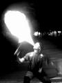
| Appears contrived. The blue background is distracting. Image is just plain artificial. |
|
| Photographer found comment helpful. |
|
|
03/01/2004 06:50:09 PM |
| OK, a chuckle is worth a couple of points. Match is pixelated though, and that hurts the score a little. |
|
| Photographer found comment helpful. |
|
|
03/01/2004 05:31:29 PM |
| This is very good, but I would like to know how you did it. |
|
| Photographer found comment helpful. |
|
|
03/01/2004 10:32:58 AM |
| Bottom crop is a bit snug. The colors seem really bright. I think for the most part your idea was good but the execution is a little weak. Shooting something like foil with [shine] lighting becomes an issue. |
|
| Photographer found comment helpful. |
|
|
03/01/2004 01:57:37 AM |
| HAAAA, HAAAA....I was going to use that one, "Heart Burn" but, it didn't work out right. The pune is cute. But, the photo....well.... |
|
| Photographer found comment helpful. |
Home -
Challenges -
Community -
League -
Photos -
Cameras -
Lenses -
Learn -
Help -
Terms of Use -
Privacy -
Top ^
DPChallenge, and website content and design, Copyright © 2001-2025 Challenging Technologies, LLC.
All digital photo copyrights belong to the photographers and may not be used without permission.
Current Server Time: 03/13/2025 04:10:11 PM EDT.