| Author | Thread |
Comments Made During the Challenge  |
|
|
03/09/2004 05:33:10 PM |
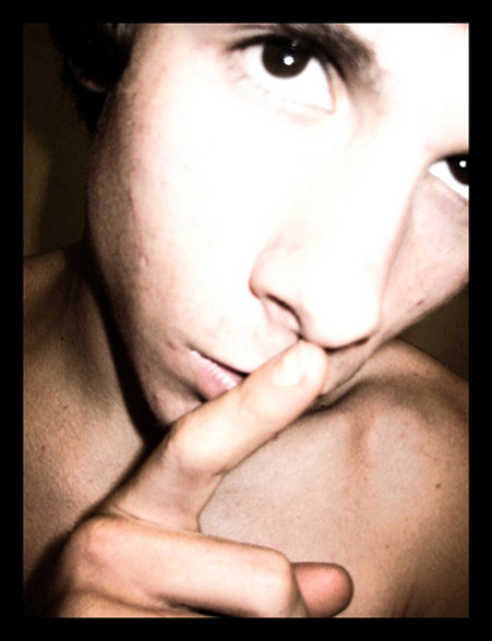
| Supose you are using the over-contrasting as some effect but I dont like it very much. Also I think that the frame is to thick, think people have to go careful on them. |
|
|
|
03/09/2004 07:43:17 AM |
| Focus is not wuite on, and the flas blows out the face too much. Other lighting could improve the image. |
|
|
|
03/08/2004 10:58:36 PM |
| Slightly disturbing. Jarring composition. |
|
|
|
03/08/2004 10:43:27 PM |
| I like the angle of the face, etc... the only thing I don't like it the out of focus look to it... 6 |
|
|
|
03/08/2004 04:29:49 AM |
| light is way to hot on the face |
|
|
|
03/07/2004 04:05:08 PM |
| Exposer seems off, seems out of focus, I like the idea and story(guessing) behind it. |
|
|
|
03/07/2004 10:35:20 AM |
| Whilst I do sometimes like the mood that harsh lighting can add to an image, I think it's overdone in this case. I do like the composition - the angle of his face and finger and the cropping choice work well. |
|
|
|
03/07/2004 02:13:05 AM |
| yet another 'finger over the lips' shot.. hohum.. picture is washed and over exposed.. |
|
|
|
03/04/2004 12:03:41 PM |
| I like the pose and composition. Face and hand out of focus, but shoulders look great! ;) Harsh lighting on face and distortion make for interest, but theme of silence could be explored a little deeper. Keep it up. :) |
|
|
|
03/03/2004 11:34:33 AM |
| Your framing, composition and idea are all good, but the overexposure on the face is too distracting. |
|
|
|
03/03/2004 11:30:30 AM |
| The artistic approach doesn't make this photo all that much better. I like it, but it's still just a guy 'shushing'. 5. [the direct flast would normally suck royally, but it works here] |
|
|
|
03/03/2004 11:06:28 AM |
I think the face is over exposed and the black border pushes the image to the background while it remains in the foreground.
On a positive note, the composition is good with an interesting viewpoint to the subject. |
|
|
|
03/03/2004 12:42:15 AM |
| Just an excellent photo. For some reason, i really enjoy the fact that is photo is not sharpen. Good stuff! |
|
|
|
03/03/2004 12:21:32 AM |
| Great idea! I would like it even more if the focus was better and the face less exposed. |
|
Home -
Challenges -
Community -
League -
Photos -
Cameras -
Lenses -
Learn -
Help -
Terms of Use -
Privacy -
Top ^
DPChallenge, and website content and design, Copyright © 2001-2025 Challenging Technologies, LLC.
All digital photo copyrights belong to the photographers and may not be used without permission.
Current Server Time: 03/12/2025 07:44:05 PM EDT.