| Author | Thread |
Comments Made During the Challenge  |
|
|
01/01/2008 11:00:45 AM |
|
|
|
12/31/2007 11:29:40 PM |
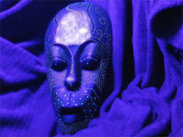
| the lighting on the forehead of the mask is distracting. too much blue for me. i think i would rather look at it on a different coloured background. i do like the print on the mask that gives it its textured look. |
|
|
|
12/30/2007 09:33:45 PM |
| Would have liked a more contrast. Lighting needs to be improved to avoid the hot spots on the forehead of the mask - 5 |
|
|
|
12/30/2007 03:27:38 PM |
| The texture of the fabric is more discernible than on the mask - unless that was your intent. |
|
|
|
12/28/2007 08:40:03 AM |
| I find the reflections on the forehead a bit distracting |
|
|
|
12/26/2007 11:11:54 PM |
|
Home -
Challenges -
Community -
League -
Photos -
Cameras -
Lenses -
Learn -
Help -
Terms of Use -
Privacy -
Top ^
DPChallenge, and website content and design, Copyright © 2001-2025 Challenging Technologies, LLC.
All digital photo copyrights belong to the photographers and may not be used without permission.
Current Server Time: 03/14/2025 01:37:56 AM EDT.