| Author | Thread |
|
|
01/05/2008 10:35:05 AM |
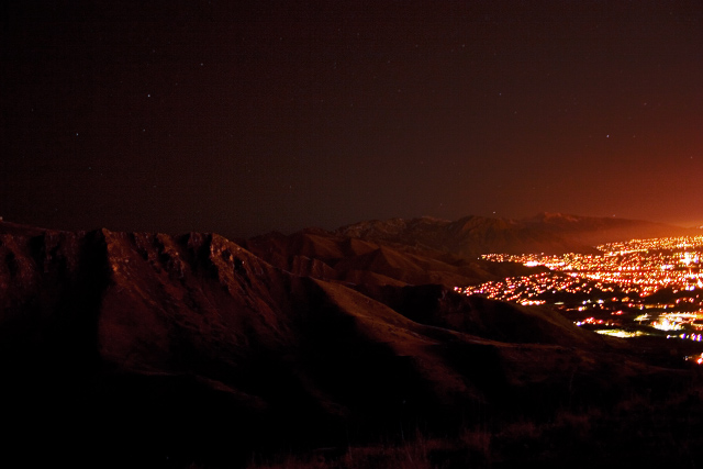
This is a great shot, I don't care what anybody says.Composition is great think much better than the whole city. Also lighting I think is perfect adds to the mood. As for the "tilt" if anything it may be lens abberation.People try to be helpful I'm not dogging that but let me say if you do not pick it apart and see the whole capture(in my mind how it's supossed to be)this is VERY underated.
But then again I never do too well here.
Just writing because I found it encouraging when someone else saw what I did. |
|
Comments Made During the Challenge  |
|
|
01/01/2008 03:10:19 AM |
| A little too dark to bring a distinct feeling. Great shot though. (6) |
|
|
|
12/31/2007 01:34:06 PM |
| Nice shot. I like the glow on the mountains. |
|
|
|
12/31/2007 11:07:29 AM |
| It looks like this was not a level shot. I would vote higher if level, also it would be cool to use a little longer exposure so that the lower part of the frame had more light. I like the red glow on the mountains. |
|
|
|
12/30/2007 06:06:57 PM |
| This picture is a little unbalanced. If you showed both sides of the city, it might have been nicer. |
|
|
|
12/30/2007 05:04:27 PM |
| The slope of the hills and the slightly askew horizon make it seem like you have captured the curvature of the earth. Could be a poster for this city. |
|
|
|
12/29/2007 10:11:15 PM |
| cool shot, I love how the city lights up the mountains, nicley done! |
|
|
|
12/29/2007 12:48:32 PM |
|
|
|
12/28/2007 04:06:44 PM |
| It looks like you started out with a good theme. Too dark to & poor visualization of focal point. |
|
|
|
12/28/2007 09:13:19 AM |
| Too much blank space on the left. Sorry. |
|
|
|
12/28/2007 12:46:29 AM |
| Neat looking glow. I would suppose there was not a lot of light to catch this with. The tilted horizon bothers me though, and really takes away from the image. |
|
|
|
12/27/2007 05:14:48 AM |
|
|
|
12/26/2007 07:05:23 PM |
| Martian Colony? Is Ah-nold at home? :} |
|
|
|
12/26/2007 04:30:38 PM |
| I am guessing that you may have taken this from a plane, though if you did some of those mountains seem a little close for comfort. Regardless of how you did it this is a great take on the challenge and it is great to see how flourescent boundaries mark a city's limit |
|
|
|
12/26/2007 01:48:31 PM |
| Good long exposure. To me, more than a "surrounded city" it looks like it continues to creep up the mountains :) |
|
|
|
12/26/2007 12:33:29 PM |
| Need more light to see what the city is surrounded by. |
|
|
|
12/26/2007 11:19:22 AM |
| looks tilted anticlockwise to me |
|
|
|
12/26/2007 03:29:23 AM |
| Very nice contrast of scenery. Something seems a bit askew in the shot. Cant put my finger on it, not sure if it is the crop or that its not straight. |
|
Home -
Challenges -
Community -
League -
Photos -
Cameras -
Lenses -
Learn -
Help -
Terms of Use -
Privacy -
Top ^
DPChallenge, and website content and design, Copyright © 2001-2025 Challenging Technologies, LLC.
All digital photo copyrights belong to the photographers and may not be used without permission.
Current Server Time: 03/11/2025 02:18:20 PM EDT.