| Author | Thread |
Comments Made During the Challenge  |
|
|
03/07/2004 09:41:07 PM |
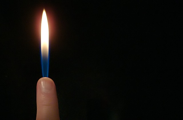
| Very clever. I like the composition too. WIsh there was a little more color in the photo |
|
 Photographer found comment helpful. Photographer found comment helpful. |
|
|
03/07/2004 08:17:29 PM |
| I so want to do this....rats! Just could figure out how to get burning and not get second and third degree burns. Guess your method is a bit safer. |
|
| Photographer found comment helpful. |
|
|
03/07/2004 12:53:19 AM |
| Nicely done, although I think a vertical format would better suit the subject. |
|
| Photographer found comment helpful. |
|
|
03/05/2004 10:33:47 PM |
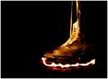
Geat composition, the space really adds to the effect.
To all intents and purposes this is a candle shot. The point deducted for the shine on the fingernail is added back for candle resemblence - clever :) |
|
| Photographer found comment helpful. |
|
|
03/05/2004 05:49:21 AM |
| Nice focus on the finger...but too much dead space on the right. |
|
| Photographer found comment helpful. |
|
|
03/05/2004 02:42:26 AM |
| nice idea and cleverly done great focus and detail 8 |
|
| Photographer found comment helpful. |
|
|
03/04/2004 11:44:19 PM |
| Nice shot and idea. Beatiful composition. |
|
| Photographer found comment helpful. |
|
|
03/04/2004 05:55:15 AM |
|
| Photographer found comment helpful. |
|
|
03/04/2004 05:14:31 AM |
| Interesting subject. Clearly photographed. Too much negative space for your eyes to wonder around . Would like to see a vertical crop so the subject would be the focus. "8" |
|
| Photographer found comment helpful. |
|
|
03/02/2004 07:23:42 AM |
|
| Photographer found comment helpful. |
|
|
03/01/2004 03:57:56 PM |
| Strong iconic feel, but the framing hinders rather than helps. |
|
| Photographer found comment helpful. |
|
|
03/01/2004 02:19:38 PM |
| great concept and execution! |
|
| Photographer found comment helpful. |
|
|
03/01/2004 10:49:25 AM |
| I think this would have worked better breaking the laws a bit and placing the finger and flame in the centre. The halo around the top of the flame could have been cloned out for a cleaner image. I also feel the finger looks a little flat and either needed a bit of PS manipulation or better lighting to liven it up a bit. One of the better ideas I've seen on this challenge though, even if I've seen it before. |
|
| Photographer found comment helpful. |
|
|
03/01/2004 04:52:58 AM |
| Clever idea, well executed, like the use of negative space to create balance. 8 |
|
| Photographer found comment helpful. |
|
|
03/01/2004 04:11:00 AM |
| HEY! They said no candles....Just kidding. This is clever and well composed. |
|
| Photographer found comment helpful. |
|
|
03/01/2004 02:25:50 AM |
| Simple, effective, good use of blank space. |
|
| Photographer found comment helpful. |
Home -
Challenges -
Community -
League -
Photos -
Cameras -
Lenses -
Learn -
Help -
Terms of Use -
Privacy -
Top ^
DPChallenge, and website content and design, Copyright © 2001-2025 Challenging Technologies, LLC.
All digital photo copyrights belong to the photographers and may not be used without permission.
Current Server Time: 03/12/2025 09:26:07 AM EDT.