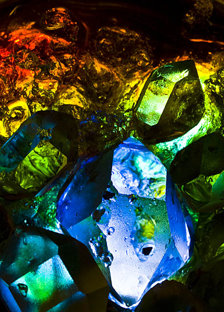
Another blatant attempt at a populist photo, selling out my artistic integrity for what I think will be received well by DPC voters. I'm sure this is a phase and I hope I get over it soon. Pretty bold colours and crystals, plus the ice... those are the ingredients I'm betting on (no aurorae here so this is the best I can do in London).
For this shot I put a glass tea light holder on top of a battery powered LED light and filled it with ice chips from the bottom of a bag of ice. I then dropped herkimer diamonds/quartz crystals on top one by one until they were nicely placed and then dropped food colouring around the edges. Initially I dropped blue around the centre crystal and yellow around the outside, but then dropped red at 3rds around the edges and as it melted brought out the green.
Shot at f22 to try to get as much DoF as possible but it was an impossible task (or at least with my crappy Sigma macro it is).
PP: converted from RAW, cropped, levels, blacks, contrast, saturation, vibrance, then usm, noise ninja, resize, jpg.
I've got a few really nice shots from messing about with this and I've had to guess which one to use. Got some gorgeous outtakes that may well be better than this - it seems my taste is way out from DPC voter taste (not necessarily a bad thing ;)).
I'd like this to do better than a 6 but I'm guessing late 5s.
Post Challenge: wow...really didn't do as well as I'd have hoped for. I thought this was a stronger image than it was voted - please give me some constructive criticism as to why you don't like it (be harsh, it's okay with me!).
Outtakes (unedited):
Statistics
Place: 85 out of 161 Avg (all users): 5.3891 Avg (commenters): 5.5000 Avg (participants): 5.2500 Avg (non-participants): 5.4364 Views since voting: 1145 Views during voting: 322 Votes: 221 Comments: 6 Favorites: 0
Hi Qu,
I like the creativity of the image, the flow of colors are awesome the blues, green, yellows & reds are really nice !. The composition is well done as is the framing. What I think hurt you here are the dead spots, there are three - bottom third right hand corner. Just to the left of that where it goes up & left leaving the image. The other spot right side half way up the image. I looked at your other image ice3 & yes it is much cleaner and more compact I think it would have scored better. What is more of a concearn to me is the comment. The populist, I wouldn't worry about trying to satisfy everyone or one group this will only lead to three things. Frustration, second guessing yourself & your images, & taking away your creativity all of which are bad news. I have looked at your work it is wondrful. Just stick with your ideals & creativity the scores will come.
The general colors are pleasing, but the abstract nature of it isn't. Its a bit on the dark side with no real flowing or purposeful composition. It just feels like a jumbled mess. I think its very possible that your third outatke would have scored better as its a generally cleaner image with more distinct shapes.