DPChallenge: A Digital Photography Contest You are not logged in. (log in or register
 
Challenge Entries
Portfolio Images
This image is not part of a public portfolio.
Forgotten storage shed
photom1946


Photograph Information Photographer's Comments
Challenge: Free Study 2008-01 (Advanced Editing VI ("Time Lapse"))
Camera: Fujifilm FinePix S3 Pro
Lens: Nikon AF Zoom-Nikkor 35-70mm f/2.8D
Location: West Cobb county, Georgia
Date: Jan 7, 2008
Aperture: f/11.3
ISO: 100
Shutter: 1/60
Date Uploaded: Jan 8, 2008

Found this old barn, captured at f/11, using tripod - for max. sharpness. Sun was in the perfect location behind me. Sky was brilliant blue, but in color it did not capture the tone I saw. Removed some physical trash from around the image I could not shoot out of the way of or crop out of the image. Adjusted color in channel mixer to monochrome, then selectively added color back into the image to match the rusty theme of roof as a sepia toned image. Adjusted levels, USM and sized for challenge. Second attempt at using layers...

Statistics
Place: 386 out of 428
Avg (all users): 4.7634
Avg (commenters): 6.0000
Avg (participants): 4.8161
Avg (non-participants): 4.6591
Views since voting: 558
Views during voting: 183
Votes: 131
Comments: 3
Favorites: 0


Please log in or register to add your comments!

AuthorThread
02/13/2008 01:35:23 PM
CRITIQUE CLUB CRITIQUE
by karmat

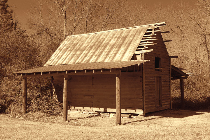
Compositionally, this is a strong, stable shot. It is a bit centered, which normally doesn't help, but in this case I think it documents the architecture of the building well. It has just enough of the background to give some context, but not so much as to clutter it up or be distracting.

Technically, your focus is very good. Also, your exposure shows a lot of the details, but I think that may be what makes the shot look a bit "flat." My very first impression of this shot was "Nice shot, but doesn't have a lot of depth). There are no definitive "blacks" in the shot, or none that really define the textures of the building. I think a bit more contrast would help, even if it meant burying some of the details in shadows.

The sepia is a nice touch. It helps to further communicate the age of the building.

If I need to further elaborate, or explain, please PM.

Karma
  Photographer found comment helpful.
 Comments Made During the Challenge
02/02/2008 03:48:55 PM
The composition and clarity are excellent. The tonality of this causes it to lose something for me.
  Photographer found comment helpful.
02/01/2008 05:08:39 PM
I think this could use more contrast.
  Photographer found comment helpful.


Home - Challenges - Community - League - Photos - Cameras - Lenses - Learn - Help - Terms of Use - Privacy - Top ^
DPChallenge, and website content and design, Copyright © 2001-2025 Challenging Technologies, LLC.
All digital photo copyrights belong to the photographers and may not be used without permission.
Current Server Time: 03/17/2025 07:12:25 AM EDT.