| Author | Thread |
|
|
04/12/2008 01:39:04 PM |
| I love the processing here - beautiful. |
|
 Photographer found comment helpful. Photographer found comment helpful. |
|
|
01/20/2008 10:33:18 AM |
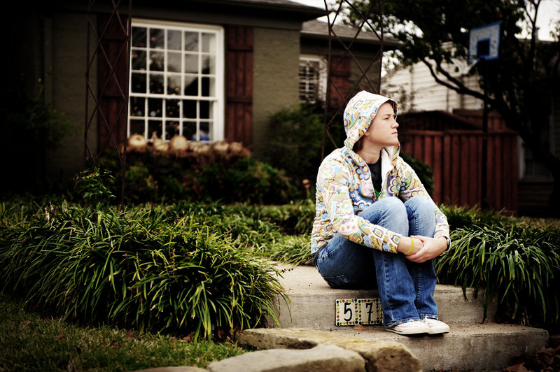
| This one, overall, is less effective, I think, in portraying boredom. B&W would be better. In the first image, her jacket was very contrasty, which immediately attracted the eye. Here it is less contrasy. Additionally, the basketball goal is distracting as well. But that's easily cloned out. And I like her pose better in this one than the first one. She looks really bored here. |
|
| Photographer found comment helpful. |
|
|
01/20/2008 06:34:34 AM |
Another comment after your request in the thread.
A similar shot to the first, and to be honest I think that this one might have been the better of the two for black and white due to the tigher crop. You have a darker background here, with very little on the light side in it, while your subject is fairly well lit and would convert relatively light in black and white. We generally see a single subject staring off in to the distance with room on the side that they are looking too. At first glance, I got the impression that she heard a commotion down the street and had turned that way to see what it was.
Even though I think that it would be the better of the two for black and white I still like the tones used in this shot. |
|
| Photographer found comment helpful. |
Home -
Challenges -
Community -
League -
Photos -
Cameras -
Lenses -
Learn -
Help -
Terms of Use -
Privacy -
Top ^
DPChallenge, and website content and design, Copyright © 2001-2025 Challenging Technologies, LLC.
All digital photo copyrights belong to the photographers and may not be used without permission.
Current Server Time: 04/08/2025 09:49:57 PM EDT.