| Author | Thread |
|
|
01/28/2008 02:54:19 PM |
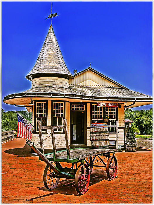
Heine, interesting experiment. I actually like the image, and if taken at face value, knowing this is processed to achieve this result I believe it is quite good, just a tough sell in an open challenge.
Jack |
|
 Photographer found comment helpful. Photographer found comment helpful. |
Comments Made During the Challenge  |
|
|
01/27/2008 11:33:13 PM |
| Nice scene, colors are nice, but the halos are distracting and make it look over processed to me. |
|
| Photographer found comment helpful. |
|
|
01/27/2008 09:47:14 PM |
| A bit over 'cooked' for my tastes... though it would be nice as a drawing. |
|
| Photographer found comment helpful. |
|
|
01/27/2008 08:52:36 PM |
| Interesting processing. It looks nice. Good job |
|
| Photographer found comment helpful. |
|
|
01/27/2008 03:25:05 PM |
|
| Photographer found comment helpful. |
|
|
01/27/2008 01:34:07 AM |
| I can see why you liked this subject, I like it too! But it looks to me like you've gone overboard with editing ... possibly an HDR experiment ... leaving distracting halos around the building and to a lesser degree, the wagon. HDR seems to be the wave of the future, but I'd suggest backing off a bit. |
|
| Photographer found comment helpful. |
|
|
01/27/2008 12:44:24 AM |
| The tone mapping is over-done for my taste. |
|
| Photographer found comment helpful. |
|
|
01/25/2008 07:17:01 PM |
| My first impression is that this is really, really colorful. I like the framing and composition, but whether the image is successful or not depends on what you are trying to accomplish. To my eye, it looks too much like a cartoon, and would be better if the processing were toned down a little. Others may see it differently. |
|
| Photographer found comment helpful. |
|
|
01/25/2008 01:45:33 AM |
| Over saturated/over processed IMO. The halo/glow around the building against the sky is distracting. The composition is very nice, but would be better if less processed. IMHO |
|
| Photographer found comment helpful. |
|
|
01/24/2008 11:49:10 AM |
| This is simply too far done for me. I'm all for editing that adds punch, but the image still has too look a little more believable than this. |
|
| Photographer found comment helpful. |
|
|
01/23/2008 11:40:17 PM |
| Halo really puts this off for me I'm sorry! |
|
| Photographer found comment helpful. |
|
|
01/23/2008 02:44:32 PM |
| Sorry, too fake looking for me. 4 |
|
| Photographer found comment helpful. |
|
|
01/23/2008 01:13:12 PM |
| Wow, so bright! A little too much for me :) |
|
| Photographer found comment helpful. |
|
|
01/22/2008 06:27:22 PM |
Ow ow ow! Way over processed. The objects in the picture have terrible haloing. I like the color in the shot but they are oversaturated.
Sorry :( |
|
| Photographer found comment helpful. |
|
|
01/22/2008 06:17:14 PM |
| i think you may have slightly over-done the saturation on the sky. |
|
| Photographer found comment helpful. |
|
|
01/22/2008 09:56:42 AM |
| Way overboard on the HDR. Sorry... that's a big pet peeve of mine nowadays. That takes a shot that would have probably been a 6 or 7 down to a 3 for me. |
|
| Photographer found comment helpful. |
|
|
01/22/2008 03:32:18 AM |
| too much tone mapping for me |
|
| Photographer found comment helpful. |
|
|
01/22/2008 01:35:11 AM |
| The editing seems pretty apparent on this - see the white halos. |
|
| Photographer found comment helpful. |
|
|
01/21/2008 10:41:23 PM |
| I know it well. I have a photo of my kids sitting on that very cart fifteen years ago when they were little. |
|
| Photographer found comment helpful. |
|
|
01/21/2008 10:18:23 PM |
| Way overdone here. You have an beautifully captured image, great focus and historic feel, that has turned into a cartoon with the processing that was done. Sorry. A minor punch up of the colours and this is a 7, but the result you have submitted is a 4 imo. Sorry. Good Luck. |
|
| Photographer found comment helpful. |
|
|
01/21/2008 07:30:29 PM |
| Illustration in technique, rather than photographic. It is an interesting curiosity which one might tire of and seek something ore restful to look at. |
|
| Photographer found comment helpful. |
|
|
01/21/2008 02:10:49 PM |
| So far you are in my top 2 for most insanely tone-mapped entry! I like it! |
|
| Photographer found comment helpful. |
|
|
01/21/2008 01:24:09 AM |
| Interesting treatment, except that the sky appears "painted", and should have a gradient. |
|
| Photographer found comment helpful. |
|
|
01/21/2008 12:25:15 AM |
| the cartoonish sky kills it for me |
|
| Photographer found comment helpful. |
Home -
Challenges -
Community -
League -
Photos -
Cameras -
Lenses -
Learn -
Help -
Terms of Use -
Privacy -
Top ^
DPChallenge, and website content and design, Copyright © 2001-2025 Challenging Technologies, LLC.
All digital photo copyrights belong to the photographers and may not be used without permission.
Current Server Time: 03/17/2025 06:25:35 AM EDT.