| Author | Thread |
Comments Made During the Challenge  |
|
|
10/03/2002 06:31:00 PM |
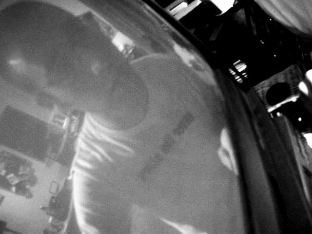
| The two basic premises of the challenge well met, but not such a good photo. The screen is soft and seems grainy, but fairly well lighted. Off the screen is pretty dark and unappealing. Few details show up on the reflection, even the words on the shirt are unreadable. 6 Swash |
|
|
|
10/03/2002 05:09:00 PM |
I like the rotation and curves. I find the contrast within the reflection itself too low - and this is exaggerated for me by the intense blackness at the other side of the image.
There seems to be unusually high levels of compression artifact - though I am not lowering score on that basis.
Kavey |
|
|
|
10/01/2002 04:19:00 PM |
Meets the Challenge: Yes
Artistic Merit (Would I print/frame/hang it?): 2
Creativity (Did a lot of thought go into this photo?): 4
Technical (Focus/DOF/Lighting/Etc): 4
Composition (Subject well-positioned and framed): 5
WOW Factor (Is the photo interesting?): 3
Score: 4 - setzler |
|
|
|
10/01/2002 11:33:00 AM |
| I like your title. It fits perfectly. The angle gives it a look of frenzy, certainly fitting the fact that one is trapped inside. Very original. |
|
|
|
10/01/2002 10:13:00 AM |
| For me, this doesn't work. The use of black and white leaves the shot looking lack lustre, and the under exposed look simply darkens the image to a point where nothing can be discerned. Composition isn't bad, but having nothing to really call the central object (is it the screen or the reflection) makes it hard to call. The area at top right draws the eye away from the screen (and reflection) and there's nothing really there to look at. I'd try re-shooting the shot in colour and masking the negative space so that it does doesn't draw attention away from what is a potentially superb idea. Sorry to be so negative, but I don't like to score low and not say why�. (2) |
|
|
|
10/01/2002 02:29:00 AM |
| The right side of the photograph is too dark, and since I can't determine what is there, it is distracting. |
|
|
|
09/30/2002 07:03:00 PM |
| A bit too dark and grainy IMO |
|
|
|
09/30/2002 04:17:00 PM |
| Nice job. TV star! lol Fun shot. Score 7 Justine |
|
Home -
Challenges -
Community -
League -
Photos -
Cameras -
Lenses -
Learn -
Help -
Terms of Use -
Privacy -
Top ^
DPChallenge, and website content and design, Copyright © 2001-2025 Challenging Technologies, LLC.
All digital photo copyrights belong to the photographers and may not be used without permission.
Current Server Time: 03/12/2025 11:57:56 PM EDT.