| Author | Thread |
|
|
01/25/2008 05:20:03 PM |
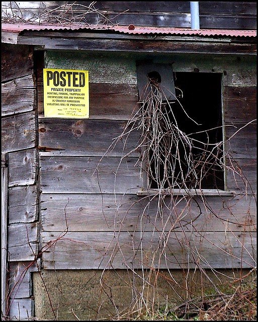
| I really think that you had a good starting image. The composition does feel a bit cramped, especially with the sign so close to the edge of the image. Leaving some negative space can be as simple as just leaving some extra space around you main focal point, just like you did in the top two alternatives below. I do like those much better, with the one at the top being my fav of the two. If you could have shot this with a better, more interesting sky, I think your score would have grown some. I also think that it would be a more interesting shot in the summer with the greenery on the vines, but we live by the hand of Langdon here. He put the challenge in for this week, not the summertime. Nice work with the post-processing. |
|
 Photographer found comment helpful. Photographer found comment helpful. |
|
|
01/25/2008 11:42:51 AM |
Thanks for the comments. I'm still not sure what I did wrong, lol.
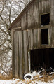
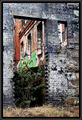
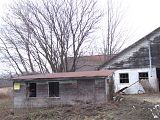
As for the pulling back and/or negative space - there wasn't really much "space." It was pretty cluttered. I originally thought of using one of these -
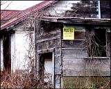
I did have one from a different angle where there's a large patch of grass in the foreground, but it doesn't really have as much impact as it does w/ the sign.
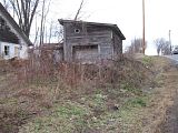 (This and the following images are straight from the camera - no processing, just resized by photobucket) (This and the following images are straight from the camera - no processing, just resized by photobucket)
Here's the whole shed w/ the background -
and the original shot I used - 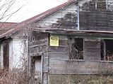
Thanks again
|
|
|
|
01/24/2008 05:20:29 PM |
| Very good job fitting the challenge here. It definitely feels abandoned. One thing I don't like about it however is that it doesn't have any negative space, making it feel a bit cluttered. It has pretty decent lighting as mentioned by Jason, maybe trying a more unique perspective rather than just eye level would have also added alot. Nonetheless it is a pretty good shot, and certainly meets the challenge as good as one can. Keep up the good work. |
|
| Photographer found comment helpful. |
|
|
01/24/2008 04:15:09 PM |
Technicals: Lighting and processing are decent. One thing that jumps out to me is that other than the sign the color adds very little to the composition. Whenever I get a shot like this I immediately think about B&W. On this shot you could do B&W and possible a selective desat of the posted sign (although I'd not have the yellow blazingly saturated. I'd think about a half saturation or something like that). Composition seems a little cramped. I'd like to see more. Of course I don't now what else there is to see so perhaps it was out of necessity. By pulling back, you may also consider a landscape orientation instead of portrait.
The feel: Does feel abandoned. As I gather from your comments, you like the shed better in the summer and I'd probably agree. The bare tangle of briars is not nearly as nice as it would be with some color and leaves. What can you do? |
|
| Photographer found comment helpful. |
Comments Made During the Challenge  |
|
|
01/16/2008 09:20:48 PM |
Presented nicely in the frame.. The vines coming out give dimension and dept to the shot.. And the posted sign is Perfect... Lot's of luck~~
Hope this makes it inthe top 10.... |
|
| Photographer found comment helpful. |
|
|
01/16/2008 09:04:33 PM |
|
| Photographer found comment helpful. |
Home -
Challenges -
Community -
League -
Photos -
Cameras -
Lenses -
Learn -
Help -
Terms of Use -
Privacy -
Top ^
DPChallenge, and website content and design, Copyright © 2001-2025 Challenging Technologies, LLC.
All digital photo copyrights belong to the photographers and may not be used without permission.
Current Server Time: 03/17/2025 02:38:27 AM EDT.