| Author | Thread |
|
|
04/09/2008 10:41:22 AM |
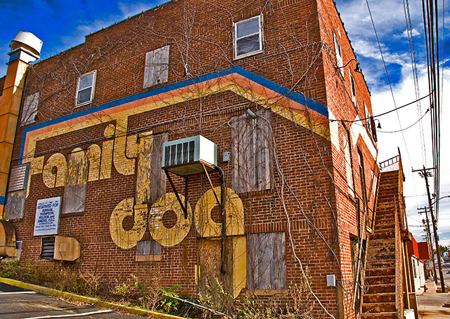
critique as requested in the forums.
Issues:
#1 subject of the photo = building. It can work for you. It can also fail to work for you. Personally, I think you did OK with what you had to work with, but there is no real sense of dramatics with this image. Nothing interesting about the POV. It's just a building from standing height eye level. There is nothing else in the picture to give context or compare to anything else in the pic. The human interest aspect is a bit lacking.
#2 Processing. A number of issues here, but not all bad. I like the processing on the building as related to the general look of it. Some problems that are commonly penalized here on DPC such as an 'overprocessed' look (although that one's a bit pot luck on how it's received IMHO - some people manage OK with an overprocessed look for certain reasons), blown highlights and not-smooth color transitions. I am guessing from your comment 'a different approach for me' that much of this you are aware of and at least some of it was intentional.
Specifically:
- The whites in the clouds are blown. This could be avoided by bringing the midtones up using curves (or levels if you want the slightly more complicated route) instead of brightness and contrast. It appears that your pushed the brightness of the building since it seems quite bright.
- The blues in the sky are too strong and not natural looking. Again, this may be intentional, but it's just a bit over the top I think... The sky is not a major element of the picture, so there's no real reason that it should be emphasized so strongly. This could be a result of pushing the saturation too hard, or something else, but a possible solution (and legal in basic) is to use saturation on a specific channel and tone it back a bit. Selective color can also help here if needed.
#3 Lines. Honestly, I'm not feeling anything from any of the lines in the picture. None of them are specifically pushing my eyes in any particular direction. For a picture full of lines, none of them seem to have much purpose. It could be worse.
Bottom line, I think the subject of the picture just isn't that DPC friendly. If it were for a newspaper article about a record store called the family dog or something, it would be fine. It's a decent presentation of the side of a building.
I think it would have been helped a lot by a skinny kid in running shoes with no socks bouncing a basketball though. or something... |
|
 Photographer found comment helpful. Photographer found comment helpful. |
Comments Made During the Challenge  |
|
|
01/22/2008 10:14:00 PM |
| Looks familiar. I think I've seen this building in another shot somewhere. I like the perspective and strong PP effects. The cut off tip of the building does not work for me though. I think a slightly closer crop may have given it more ooomph. Still good, however. |
|
| Photographer found comment helpful. |
|
|
01/19/2008 09:25:47 PM |
| Great texture, color, angle. |
|
| Photographer found comment helpful. |
|
|
01/17/2008 07:57:47 PM |
| This must be in California, with some relation to Bill Gram and the Dead??? |
|
| Photographer found comment helpful. |
|
|
01/17/2008 02:22:53 AM |
| Nice building. Maybe it was not possible, but it would have been better to take the picture from farther away or with a wider lens so that it fits entirely in the image. |
|
| Photographer found comment helpful. |
|
|
01/16/2008 07:29:07 PM |
| I'm grateful for this shot. |
|
| Photographer found comment helpful. |
|
|
01/16/2008 10:06:58 AM |
| Seems a bit oversaturated, especially the brick on the right (and the red on the next building), but I really like the composition. |
|
| Photographer found comment helpful. |
|
|
01/16/2008 07:59:05 AM |
| the PP is great but feels too fresh & new in contrast to the subject, for me this takes away from any sense of abandonment |
|
| Photographer found comment helpful. |
|
|
01/16/2008 01:38:37 AM |
| I'd have liked to see a different angle on this, with perhaps more detail on the rusted steps. Just my taste. |
|
| Photographer found comment helpful. |
Home -
Challenges -
Community -
League -
Photos -
Cameras -
Lenses -
Learn -
Help -
Terms of Use -
Privacy -
Top ^
DPChallenge, and website content and design, Copyright © 2001-2025 Challenging Technologies, LLC.
All digital photo copyrights belong to the photographers and may not be used without permission.
Current Server Time: 03/17/2025 07:14:39 AM EDT.